Home » Energy
Category Archives: Energy
Electric Vehicles Reduce GHG Emissions, If You Live in the Right Place
In the last post, I looked at why an electric vehicle might be expected to have lower GHG emissions than a gasoline vehicle. In this post, I will look at what some studies have actually found. My original post on this subject was in 2015, and it can be found here.

Figure 1. Source: European Environment Agency, 2018.
A report published by the European Environment Agency looked at electric vehicles in Europe. This report concluded that the answer depended on the energy mix in the grid. As shown in Figure 1, an electric vehicle (BEV = Battery Electric Vehicle, specifically a Nissan Leaf) drawing electricity generated by burning coal caused the most GHG emissions of all. But Europe has a significant amount of clean energy in its grid. If that same Nissan Leaf consumed electricity that matched the average European mix, then it would have emissions about 40% less. Compared to a standard internal combustion vehicle burning gasoline, the electric vehicle would have 26-30% fewer lifetime emissions.
.
.
.
.

Figure 2. Source: Nealer, Reichmuth, and Anair, 2015.
The Union of Concerned Scientists published an analysis in 2015, almost as long ago as my original post on the subject. They focused on a “well-to-wheels” analysis. This looks at the GHGs emitted by the fuel consumed to operate the vehicle, including the GHGs emitted to obtain and produce the fuel. But it does not look at GHGs emitted to manufacture or dispose of the vehicle itself.
The study used an unusual metric for its comparison: the number of miles per gallon (MPG) that a gasoline vehicle would have to achieve in order to have emissions as low as those of an electric vehicle. Using this rather unintuitive metric, the higher the MPG a gasoline vehicle would have to achieve, the more of an advantage the electric vehicle had. Like the previous report, this study also found that the answer depended on the energy mix in the grid (see Figure 2). Where there is a lot of clean electricity in the grid, a gasoline vehicle would have to achieve up to 135 MPG to reduce its emissions to those of an electric vehicle. However, where there is mostly coal-generated electricity on the grid, a gasoline vehicle would only have to achieve 35 MPG. In 2016, the average fuel efficiency of a passenger car (SUVs and pickup trucks not included) was 37.7 MPG. (Source: Bureau of Transportation Statistics.)

Figure 3. Sourse: Nealer, Reichmuth, and Anair, 2015.
As Figure 3 shows, the study found that, assuming the average energy mix on the U.S. grid in 2015, battery electric vehicles would emit 51-53% less GHG to build and operate.
.
.
.
.
.
.
.
.
.

Figure 4: Lifetime GHG Emissions of Two Types of Car. Source: Kukrega, 2018.
A study published by the City of Vancouver compared the lifetime emissions per kilometer driven of a Ford Focus (gasoline vehicle) and a Mitsubishi i-MiEV (battery electric vehicle). The findings were presented as grams of GHG emitted per kilometer driven. As Figure 4 shows, The study found that the Ford emitted almost 400 grams of CO2e per kilometer, while the i-MiEV emitted slightly more than 200 – a 48% reduction. Now, the study was for British Columbia, and BC has a lot of clean energy in its grid.
These sources all agree: whether an electric vehicle reduces GHG emissions depends on the mix of energy that is in the electrical grid. This is the same conclusion I found when I looked at this question 4 years ago – the situation has not changed.

Figure 5. Source: Energy Information Administration.
Unfortunately, neither has the situation here in Missouri. As Figure 5 shows, we still have a grid that generates the vast majority of its electricity by burning coal. If GHG emissions are what you care about, then driving an electric vehicle here makes no sense. In other parts of the country, however, it might make a great deal of sense.
Sources
Bureau of Transportation Statistics. 2016. Average Fuel Efficiency of U.S. Light Duty Vehicles. Downloaded 9/3/2019 from https://www.bts.gov/content/average-fuel-efficiency-us-light-duty-vehicles.
Department of Energy. 2019a. Emissions from Hybrid and Plug-In Electric Vehicles. Downloaded 9/2/2019 from https://afdc.energy.gov/vehicles/electric_emissions.html.
Department of Energy. 2019b. “Find and Compare Cars.” www.fueleconomy.gov. Viewed online 9/2/2019 at https://www.fueleconomy.gov/feg/findacar.shtm.
U.S. Energy Information Administration. 2019. Missouri State Energy Profile. Downloaded 90302019 from https://www.eia.gov/state/?sid=MO#tabs-4.
European Environment Agency. 2018. Electric Vehicles from Life Cycle and Circular Economy Perspectives. Downloaded 9/2/2019 from https://www.eea.europa.eu/publications/electric-vehicles-from-life-cycle/electric-vehicles-from-life-cycle/viewfile#pdfjs.action=download.
Kukreja, Balpreet. 2018. Life Cycle Analysis of Electric Vehicles. City of Vancouver. Downloaded 9/3/2019 from https://sustain.ubc.ca/sites/sustain.ubc.ca/files/GCS/2018_GCS/Reports/2018-63%20Lifecycle%20Analysis%20of%20Electric%20Vehicles_Kukreja.pdf.
Nealer, Rachael, David Reichmuth, and Don Anair. 2015 Cleaner Cars from Cradle to Grave. Union of Concerned Scientists. Downloaded 9/2/2012 from https://www.ucsusa.org/sites/default/files/attach/2015/11/Cleaner-Cars-from-Cradle-to-Grave-full-report.pdf.
Will Electric Cars Save The World, or Is It All Marketing Hype?
There is a lot of hype about electric vehicles. On the Internet you can find articles heralding electric vehicles as world saviors, due to reduced greenhouse gas emissions (GHGs). You can also find articles purporting to debunk that idea. Then you find articles debunking the debunkers, and so forth.
In 2014, I reported on a study comparing the lifetime carbon emissions of electric vehicles vs. gasoline powered automobiles. The study concluded that whether electric vehicles produced fewer greenhouse gas emissions depended on where you lived. If you drew your energy from an electricity grid with low carbon sources of electricity (translation: not generated by burning coal), your electric vehicle would produce fewer GHG emissions than would a gasoline powered vehicle. An electric vehicle consuming electricity that came from 100% renewable sources was the lowest emitting type of all vehicles. However, if you drew your energy from a grid with high carbon sources of electricity, then an electric vehicle was perhaps the worst kind of vehicle you could own, at least from the perspective of GHG emissions. (See here for my previous post.)
It has been 4 years. Perhaps it is time to look again. In this post, I’ll look conceptually at why an electric vehicle might be expected to have lower GHG emissions than a gasoline vehicle. In the next post, I look at some studies I was able to find, and report what they had to say.
A lifetime analysis considers all of the GHGs emitted by a vehicle during its entire lifetime. Typically they divide the life of a vehicle into 3 stages. First is the manufacturing: raw materials have to be mined, transported, processed, and refined. Then they have to be manufactured into parts. Then the parts have to be transported to the assembly plant, where the vehicle is put together. All of these stages consume energy, which means they emit GHGs.
Many of the components of gasoline and electric vehicles are similar in the amount of GHG emitted during manufacture. However, one component is not: gasoline cars store their energy in gas tanks, which are not especially energy intensive to build. Electric cars, however, store their energy in lithium-ion batteries. These batteries are energy intensive to build in all phases of manufacture: obtaining the raw materials, refining it, and constructing the batteries. Thus, in terms of manufacturing, the studies I have looked at agree that it is more carbon intensive to manufacture an electric vehicle than a gasoline vehicle. However, the largest area of uncertainty in the analysis of electric vehicles involves just how much GHG is emitted by manufacturing a lithium-ion battery. Estimates disagree.
Second, the vehicle is driven by its owner or operator. In this stage, the vehicle consumes fuel. Most studies agree that the fuel consumed by a vehicle is the largest source of GHG emissions during the life of the vehicle. Burning gasoline to power an internal combustion engine is relatively energy inefficient – only a fraction of the energy is used to move the vehicle down the road, the rest gets wasted. Further, it is not particularly clean. The result is that vehicles release a lot of GHGs (and also other forms of pollution). And finally, every time the vehicle stops, all of that wonderful energy moving the car down the road is dissipated into heat by the friction of the brakes. It is just thrown away.
Electric motors are much more energy efficient than are gasoline motors. Further, when an electric vehicle stops, it can recapture some of the energy of the moving car through regenerative braking. The recovered energy gets put back into the battery, and it is used to power the car the next time it starts moving. This is the advantage hybrid cars have, and it is why they get better gas mileage than do conventional cars. A Toyota Corolla (a compact gasoline burning car) will go 36 miles on the energy in a gallon of gas. On the other hand, a Nissan Leaf, an all-electric car, will go 112 miles on an equivalent amount of energy.
Further, an electric vehicle draws its energy from the electrical grid, where there is a much greater opportunity for the energy to be clean. To oversimplify the point, renewable energy (solar, wind, and hydro) are the lowest GHG forms of energy we have. Natural gas is next, then comes oil, and worst is coal. (I’ve left nuclear out; it is low GHG-producing, but it is objectionable for other reasons.) Electrical generators can be inefficient, just like gasoline engines are. However, there is a much greater chance that some of the electricity on the grid will come from clean sources. If it comes from coal, then the electricity on which the car runs will be particularly high in GHG emissions, although they will be emitted at the power plant, not the tailpipe of the vehicle. If it has a significant mix of solar, wind, hydro, or natural gas, then it will be lower in GHG emissions.
The third step involves disposing of and/or recycling vehicle components. The studies I have read suggest that the GHGs emitted from disposing of and recycling gasoline and electric vehicles are roughly equivalent, except for that pesky lithium-ion battery. There is some hope that in the future it can be effectively recycled or reused (it will still be suitable for many uses, just not powering a car). However, this is uncertain. Thus, as in manufacturing, the GHG emissions associated with disposing of and/or recycling an electric vehicle were estimated to be higher than those for a gasoline engine.
So, the question becomes: are the GHG savings from operating an electric vehicle more than the higher emissions during manufacture and disposal? And if so, by how much?
In the next post, I’ll look at some studies that try to answer that question.
Sources
Bureau of Transportation Statistics. 2016. Average Fuel Efficiency of U.S. Light Duty Vehicles. Downloaded 9/3/2019 from https://www.bts.gov/content/average-fuel-efficiency-us-light-duty-vehicles.
Department of Energy. 2019a. Emissions from Hybrid and Plug-In Electric Vehicles. Downloaded 9/2/2019 from https://afdc.energy.gov/vehicles/electric_emissions.html.
Department of Energy. 2019b. “Find and Compare Cars.” www.fueleconomy.gov. Viewed online 9/2/2019 at https://www.fueleconomy.gov/feg/findacar.shtm.
U.S. Energy Information Administration. 2019. Missouri State Energy Profile. Downloaded 90302019 from https://www.eia.gov/state/?sid=MO#tabs-4.
European Environment Agency. 2018. Electric Vehicles from Life Cycle and Circular Economy Perspectives. Downloaded 9/2/2019 from https://www.eea.europa.eu/publications/electric-vehicles-from-life-cycle/electric-vehicles-from-life-cycle/viewfile#pdfjs.action=download.
Kukreja, Balpreet. 2018. Life Cycle Analysis of Electric Vehicles. City of Vancouver. Downloaded 9/3/2019 from https://sustain.ubc.ca/sites/sustain.ubc.ca/files/GCS/2018_GCS/Reports/2018-63%20Lifecycle%20Analysis%20of%20Electric%20Vehicles_Kukreja.pdf.
Nealer, Rachael, David Reichmuth, and Don Anair. 2015 Cleaner Cars from Cradle to Grave. Union of Concerned Scientists. Downloaded 9/2/2012 from https://www.ucsusa.org/sites/default/files/attach/2015/11/Cleaner-Cars-from-Cradle-to-Grave-full-report.pdf.
Missouri Has A Big, Unused Wind Resource

Figure 1. Source: Department of Energy.
Missouri is blessed with a significant wind energy resource, less than 1% of which is being exploited, according to data from the United States Department of Energy. In all of the following data, the speed of the wind has been measured at 80 meters above the ground, the typical tower height of a wind turbine.
Figure 1 shows the potential wind capacity of the United States by state. Texas has more wind potential than any other state, at 1.3 million megawatts. Missouri ranks 16th in most potential, with 279,000 megawatts.
.
.
.
.

Figure 2. The map shows the estimated mean annual wind speeds at an 80-m height (262 feet). Source: Department of Energy.
Figure 2 shows where Missouri’s wind resource is located. According to the Department of Energy, an average annual wind speed of 6.0 meters per second is required to constitute a viable wind resource. On the map at right red represents average annual wind speeds of 7 – 7.5 meters/second, or about 16 mph, while orange represents average annual wind speeds of 6.5 – 7 meters/second. Missouri’s wind resource is located in a broad arc across the northern and western portions of the state.
.
.
.
.
.
.

Figure 3. Source: Department of Energy.
Figure 3 shows installed wind power capacity by state. Texas again leads the way, with 24,899 megawatts of installed capacity. Iowa is second with 8,422 megawatts, and California is third with 5,885 megawatts. Missouri has 959 megawatts of installed capacity; that equals about 0.3% of our wind power potential.
.
.
.
.
.
.

Figure 4. Source: United States Geological Survey.
Figure 4 shows the location of wind turbines installed in Missouri. You can see that they are all located in the northwest quadrant of the state.
.
.
.
.
.
.
.
.
.

Figure 5. Source: Department of Energy.
Figure 5 shows the energy mix on the electrical grid in Missouri. About 73% of our electricity is generated by burning coal, about 13% is generated in a nuclear plant, only 8% is generated from natural gas, and only 3.58% from wind power. Given that wind power represents 3+% of our energy mix, but only 0.3% of our wind power potential, Missouri could generate much more of its electricity using wind power.
Figure 5 also shows the amount of electricity generated by wind power in Missouri by year. You can see that between 2008 and 2012 it grew, but then it plateaued until 2016, and has grown since then.
Climate change presents many challenges. Among the largest is transitioning to energy resources that don’t release carbon dioxide. The data above shows that Missouri has significant potential, but we have only begun to exploit it.
Sources:
United States Department of Energy. 2019. Wind Energy in Missouri. Downloaded 4/22/2019 from https://windexchange.energy.gov/states/mo.
United States Geological Service. 2018. The U.S. Wind Turbine Database. Downloaded 4/22/2019 from https://eerscmap.usgs.gov/uswtdb.
Vehicle Miles Driven at a New All-Time High
From time-to-time, I report the number of vehicle miles traveled in the USA. I do it because vehicle travel is one of the largest contributors to air pollution and greenhouse gas emissions. You can try to make vehicles cleaner, but the bottom line is that they require energy to operate, and that energy mostly comes from fossil fuel. The more miles traveled, the more sulfur dioxide, nitrogen oxides, particulate matter, ozone, and carbon dioxide get emitted into the atmosphere.

Figure 1. Data source: Department of Transportation.
For road planning purposes, the Department of Transportation estimates the number of vehicle miles traveled in the USA, and breaks it down by state. Figure 1 shows the total vehicle miles traveled in the United States from 1980 to 2014, the most recent year for which data is available. The blue portion of the columns represents rural miles traveled, while the red portion represents urban miles traveled.
Total miles traveled increased rather steadily from 1980 until 2007, when the Great Recession began. They bottomed in 2009, and have resumed increasing unsteadily since then. They reached a new all-time high in 2014 of 3,025,656,000,000 miles. That’s 3 trillion miles. No wonder we create a lot of pollution and carbon dioxide!
More than 2/3 of the miles are driven in urban areas. The slope of the increase since 2009 does not appear to be as steep as before 2007, however the country had not fully recovered from the recession in 2014, and the rate may have increased since then. We cannot know from this data.

Figure 2. Data source: Department of Transportation.
Figure 2 shows the data for Missouri. The data series only goes back to 1995, and data for 1996 is missing. The miles driven in Missouri increased steadily until 2004, several years before the Great Recession. Since then it has slowly meandered up and down, peaking slightly higher at 41,901,000 miles in 2014. About 59% of the miles are driven in urban areas.
Of course, the population of the country is steadily growing, and so is the economy. More people driving and more economic activity naturally translate into more driving, so how are vehicle miles driven changing on a per capita or per dollar of gross domestic product basis?
.
.

Figure 3. Data source: Department of Transportation, Census Bureau.
Figure 3 shows the per capita data. The red columns represent the USA, and the blue columns represent Missouri. The data goes back to 1995, but 1996 is missing. For both the USA and Missouri, vehicle miles driven have mostly meandered sideways. The number of miles driven in 2014 is about 3% higher than 1995 for the USA as a whole, and 5% higher for Missouri.
.
.
.
.
.

Figure 4. Data source: Department of Transportation, Bureau of Economic Analysis, Federal Reserve Bank of St. Louis.
Figure 4 shows the number of vehicle miles traveled per dollar of gross domestic product. Red columns represent the USA and blue columns represent Missouri. Data for the USA extends back to 1995 (with 1996 missing), but data for Missouri only extends back to 1997. In both cases there is a clear trend: the number of vehicle miles traveled it takes to produce a dollar of gross domestic product has decreased. Nationwide, it has decreased from about 0.32 miles per dollar to about 0.17 miles. In Missouri, it has decreased from about 0.39 miles per dollar to about 0.25.
Most economists view increases in vehicle miles traveled as a sign of economic growth, and they welcome it. But in addition, it is a cause of increased pollution. I have discussed over and over in this blog the problems created by air pollution and climate change. We simply must find a way to create economic well being without sickening the planet, and ourselves in along with it. We have not yet figured that out.
Sources:
For VMT: Vehicle Miles Traveled in the USA, 1980-2011. Office of Highway Policy Information, Federal Highway Administration. http://www.fhwa.dot.gov/policyinformation/quickfinddata/qftravel.cfm.
For population: as I often find when using data from the Census Bureau, to get time series for the dates and locations I want, I often have to mash-up data from several different publications. For this post I used:
American FactFinder, U.S. Census Bureau.
Estimated Missouri Population, 1960-1990. Census Bureau, Historical Data. http://www.census.gov/popest/data/historical/index.html.
Monthly Estimates of the United States Population: April 1, 1980 to July 1, 1999, with Short-Term Projections to November 1, 2000. https://www.census.gov/popest/data/national/totals/1990s/tables/nat-total.txt.
Table 1. Intercensal Estimates of the Resident Population for the United States, Regions, States, and Puerto Rico: April 1, 2000 to July 1, 2010. http://www.census.gov/popest/data/intercensal/national/nat2020.html.
Table 1. Annual Estimates of the Population for the United States, Regions, States, and Puerto Rico: April 1, 2020 to july 1, 2011. http://www.census.gov/popest/data/historical/2010s/vintage_2011/
For Missouri GDP data: Total Gross Domestic Product by State for Missouri. Economic Research, Federal Reserve Bank of St. Louis. http://research.stlouisfed.org/fred2/series/MONGSP#.
For United States GDP: National Income and Product Accounts Tables, Bureau of Economic Analysis. http://www.bea.gov/iTable/iTable.cfm?ReqID=9&step=1#reqid=9&step=1&isuri=1. This is a data portal. Choose “Section 1 – Domestic Product and Income.” From the list that pops up, choose
Missouri’s Major Power Outages
For several posts I have been reporting on the bulk power grid in the United States. The Grid, as I have been calling it, delivers high voltage electricity from generating stations to local distributors. The local distributors step the voltage down and deliver the electricity to individual customers. Ameren, for instance, claims to own 7,500 miles of transmission lines (Ameren, undated), while Great Plains Energy (parent of Kansas City Power & Light) claims to own 3,600 miles (Westar & Great Plains Energy, 2018).
In the past, relatively small problems at specific locations on The Grid have cause cascading failures that left tens of millions of customers without power. The North American Reliability Corporation (NERC) publishes an annual reliability report, in which they evaluate the kinds of problems that been related to those types of grid collapses: electricity demand, generating capacity, transmission capacity, and operating procedures. I reported on the conclusions of that report in the last 2 posts.
Missouri has not been caught-up in those grid collapses. Widespread power outages in Missouri have been caused by severe weather. Both summer and winter storms have brought down large parts of local transmission grids.
For security purposes, the U.S. Department of Energy requires utilities to file reports of electric incidents and emergencies affecting The Grid. These reports cover much of the local distribution system, as well as the bulk power system we have been discussing in previous posts. These reports are known as OE-417 reports. They include major power outages, but they also cover things like vandalism and sabotage, even if they don’t result in a loss of power to any customers. Large utilities are required to submit the reports, but smaller utilities must file only “as appropriate.” (Department of Energy, undated.)

Table 1. Data source: Inside Energy, 2014, and U.S. Department of Energy, undated.
Inside Energy, an organization that studies the reliability of The Grid, put together a database from these reports that covers the years 2000-2014 (Inside Energy, 2014). To that database, I have added the Department of Energy data for the years 2015, 2016, and 2017, creating a database that lists events from 2000-2017. I then selected only those events in which the area affected included “Missouri,” “St. Louis,” or “Kansas City.” It is as comprehensive a database of events affecting Missouri as I can put together, though given the limits in the reporting requirements, it is not completely comprehensive. It probably catches all large power outages, but may not capture some of the smaller ones.
For a widespread power outage, what is your definition of widespread? Table 1 lists the individual events, gives a brief description of the kind of event it was, and shows how many customers were affected. In reading this table, be sure to note that many of the events affected more than one state. Thus, some of the customers affected may have been in other states.
(Click on table for larger view.)
While there have been large events, none of them match the scale of the events that plunged tens of millions of customers into darkness in the Northeast. The largest event occurred in 2006, when severe summer storms caused 2,500,000 customers to lose power in the Greater St. Louis Area (including Illinois). Anybody remember that one? I sure do. While that was less than 1/10th of the number of people affected by the Great Northeast Blackout of 2003, it was a very major event!

Figure 1. Data source: Inside Energy, 2014, and U.S. Department of Energy, undated.
The table shows 30 events overall, but none prior to 2002, and none from 2003-2005. Was that really the case? I don’t know. I have previously reported on the dollar value of weather-related damage in Missouri, and while 2004 and 2005 were very low damage years, 2000, 2001, and 2003 were not (see here). Thus, one wonders if there are holes in the data. Overall, there were on average 1.67 electrical disturbances per year.
Figure 1 charts the number of disturbances per year. While there is a lot of yearly variation (the weather is always variable from year-to-year) there is a clear trend toward an increased number of outages per year.
.
.

Figure 2. Data source: Inside Energy, 2014, and U.S. Department of Energy, undated.
Figure 2 charts the number of customers affected per year. The chart is dominated by the very large event of 2006, but even if you eliminate that one year, the chart does not seem to show a clear trend toward an increased number of customers affected.
Given that damage from weather-related events in Missouri has increased over time, and that the number of outages has increased over time, one is tempted to guess that utilities have made progress in protecting at least some parts of their distribution networks from large scale outages. One can’t be sure from this data, however, it would be an interesting topic for additional research.
The Missouri State Emergency Management Agency prepared a Missouri State Hazard Mitigation Plan in July of 2013, and the analysis in that plan suggests that power outages are not inconsequential. Many essential services rely on electrical power. For instance, many of the life-support systems in hospitals require electricity, pumps that deliver drinking water run on electricity, and the refrigerators that keep our food from spoiling do, too. Further, I have reported previously on deaths caused by extreme heat waves, and some of those deaths result from the loss of air conditioning due to power outages.
The Agency estimated that total loss of electric power results in dollar damages of $126 per person affected, per day. Multiplying that by the estimated population of each county, their estimates ranged from a low of $27,355 per day in Worth County to a high of $12,5865,820 per day in St. Louis County. (Missouri State Emergency Management Agency, 2013, pp. 3.542-3.547) These are damages that could mount-up very quickly.
Thus, the electrical grid is something we all use every single day, and our very lives depend on it. It is a huge, complex, interconnected machine. Its reliability seems an issue vital to our lives and to our security.
Sources:
Ameren. Undated. Ameren Facts and Figures. Viewed online 5/21/2018 at https://www.ameren.com/about/facts.
Inside Energy. 2014. Grid Disruption 00 14 Standardized. Downloaded 5/9/2018 from https://docs.google.com/spreadsheets/d/1AdxhulfM9jeqviIZihuODqk7HoS1kRUlM_afIKXAjXQ/edit#gid=595041757. This is a Google Spreadsheet linked to Data: Explore 15 Years of Power Outages. Viewed online at http://insideenergy.org/2014/08/18/data-explore-15-years-of-power-outages.
Missouri Satate Emergency Management Agency. 2013. Missouri State Hazard Mitigation Plan, July 2103. Downloaded 5/24/2018 from https://sema.dps.mo.gov/docs/programs/LRMF/mitigation/MO_Hazard_Mitigation_Plan_2013.pdf.
United States Department of Energy. Undated. Electric Disturbance Events (OE-417). Viewed online 2018-06-04 at https://www.oe.netl.doe.gov/oe417.aspx.
Westar Energy & Great Plains Energy. 2018. Merger to Form Leading Company: January 2018 Investor Update. Viewed 5/21/2018 at http://www.greatplainsenergy.com/static-files/b8b91848-48a6-4f88-8fd3-df3b59316b96.
Future Grid Resources in Missouri
In my last post I looked at the 2017 Long-Term Reliability Assessment issued by NERC, the North American Electric Reliability Corporation. In that post, I focused on a grid-wide perspective. In this post, I’ll offer a few conclusions in the report that pertain to Missouri.
In the northeastern USA, the largest power outages have been caused by relatively small failures at specific locations that caused underloads or overloads, which then cascaded into region-wide outages. They have affected tens of millions of customers. Consequently, the 2017 Long-Term Reliability Report focuses on the kinds of issues involved in those blackouts: electricity demand, generating capacity, transmission capacity, and operating procedures.
In Missouri, however, the largest power outages have been caused by storms that destroyed transmission lines, most of which are in the local transmission grid. (See Electrical Outages from Storms Increase.) The 2013 Long-Term Reliability Assessment does not cover the local transmission grid, and it does not seek to evaluate the potential for damaging storms. Thus, the findings of the report deal with important planning issues for The Grid in Missouri, but they don’t address the historical reasons for our power outages. I will look at weather-related power outages in Missouri in the next post.

Figure 1. Source: North American Reliability Corporation 2017.
The resource adequacy of Missouri’s grid depends on where you are. Some western portions of the state, including Kansas City, (see Figure 1) belong to the SPP reporting region (Southwest Power Pool). The SPP 10-year compound growth rate in demand for electricity is 0.56%. The anticipated reserve margin is projected to fall from 32.43% in 2018 to 19.85% in 2027, but remain well above NERC’s 12.00% target.
The central portion of the state belongs to the SERC-N reporting region (SERC Reliability Corporation–North). The SERC-N 10-year compound growth rate in demand for electricity is projected to be 0.38%. The anticipated reserve margin is projected to fall from 21.45% to 17.18% in 2027, still above NERC’s 15.00% target.
.
.
.

Figure 2. MISO Projected Capacity Reserve. Source: National Electrical Reliability Organization 2017.
A portion of eastern Missouri belongs to the Midwest Independent Service Organization (MISO) reporting region, including the St. Louis Metropolitan Region. The MISO 10-year compound annual growth rate is 0.28%. Though starting at 19.23% in 2018, the reserve margin level will fall below the Reference Margin Level (15.80%) in 2023, and will reach 14.56% by 2027. In fact, despite projected growth in demand, generating resources are projected to decline slightly. Figure 2 shows a graphical representation of the projection, with anticipated reserve in dark blue (anticipated reserves are based on plans announced by utilities), and prospective reserve in light blue (prospective reserves are based on potential plans discussed by utilities, but not announced).
These conclusions are more hopeful than those reached in the 2013 Long-Term Reliability Report. The primary reasons are that demand growth is projected to slow, fewer power plant retirements are projected to occur, and utilities have become better at forecasting demand and outages. That notwithstanding, we have entered a period of uncertainty with regard to our national bulk electricity grid. A few years ago legislation made it mandatory for all participants in The Grid to participate in NERC, and it gave NERC regulations the force of law. These changes hold out the potential for increased reliability and improved operations. On the other hand, many factors combine to represent threats to the long-term reliability of The Grid: aging infrastructure, environmental regulations that will force the retirement of coal-fired generating capacity, the retirement of nuclear generating capacity that has reached the end of its useful life, new generating sources that provide constantly varying amounts of power to The Grid, and uncertainty surrounding demand side management programs.
Resource adequacy in western and central Missouri is projected to be adequate through 2027. In eastern Missouri, reserves are projected to fall below the target level by 2023, and continue to edge lower through 2027. I will look at weather-related power outages in Missouri in the next post.
Source:
North American Electric Reliability Corporation. 2013. 2013 Long-Term Reliability Assessment. http://www.nerc.com/pa/RAPA/ra/Reliability%20Assessments%20DL/2013_LTRA_FINAL.pdf.
North American Electrical Reliability Corporation. 2017. 2017 Long-Term Reliability Assessment. Downloaded 4/27/2018 from https://www.nerc.com/pa/RAPA/ra/Pages/default.aspx.
Long-Term Reliability of the National Electrical Grid
The previous 5 posts have described the national electrical grid, how electricity flows on The Grid, how it is organized, Missouri’s portion of The Grid, and the complex balancing act that operators of The Grid face every day. Finally we’re in a position to look at the 2017 Long-Term Reliability Assessment. This is an annual report published by NERC, the North American Electric Reliability Corporation. The assessment identifies several main threats to long-term reliability:
- The increasing mix of variable generation may present operational and planning challenges. Let me explain. We saw in the previous post that operating The Grid is a complex balancing act: enough electricity has to be delivered to meet demand, but operators have to be careful not to damage The Grid by flowing either too much or too little electricity through any one part of it. In this balancing act, generating stations that supply ever-changing amounts of electricity complicate the balancing act. It is like a high wire aerialist: if there is a constant wind that is not too strong, he might be able to compensate for it. But if the wind starts gusting strongly, he is in real trouble!
Yet, that is precisely what wind and solar energy do – the amount of energy they deliver varies with the wind and with the clouds. We need these kinds of power sources to reduce GHG emissions, and they represent an ever-increasing portion of the energy supplied to The Grid. But the challenge of managing these constant fluctuations poses a threat to Grid reliability that will have to be managed. Specifically, operators need flexible generating sources that can increase or decrease the amount of electricity they generate quickly. As California derives a larger percentage of its electricity from intermittent sources than other areas of the country, this need is largest there, and it is increasing faster than previously predicted, - The Grid was designed around large central-station power plants as the primary source of electricity. Wind and solar power plants tend not to be as large. There are more of them, and they are more widely distributed. Integrating a lot of power plants is harder than integrating fewer. Accommodating them will require additions and changes to the distribution system.
- Resource adequacy in two reporting regions will fall below reserve margin targets. Let me explain. NERC believes that each operating region needs to maintain a generating and transmission capacity that is larger than the largest anticipated demand in order to ensure reliability. When a problem arises, the reserve is needed to make up for it. How large the reserve margin needs to be depends on the energy mix in a given region. Regions with higher intermittent energy sources require larger reserve margins. In the TRE-ERCOT region (most of Texas), generating capacity will fall below the target level by 2018. In the SERC-E region (Virginia and the Carolinas), it will fall below the target level by 2020. Neither of these regions include Missouri. Without additional generating resources, an increased likelihood of “load shedding” in these regions is possible. “Load shedding” means that they turn off electrical service to some customers or some regions in order to avoid having the whole system collapse.
- The growth of demand over the whole system is expected to be the slowest on record. Environmentally, this is good news. From a reliability perspective, the implications are primarily economic, and need to be managed appropriately.
- A transition from coal-fired power plants to natural gas-fired ones has been occurring. It will continue. The change is partial good news environmentally. Natural gas power plants produce fewer emissions than do coal-burning ones. However, as natural gas becomes a larger and larger portion of the energy mix on The Grid, the potential for interruptions in energy supply becomes more important. While current supplies seem adequate, power stations are long-term assets that last 40 years or more. For instance, Ameren’s Meramec Energy Center began operations 64 years ago, and KCP&L’s Hawthorn Power Plant began operations 65 years ago. Both are still going strong. The future supply of natural gas so far into the future is less well known than is the coal supply. This may be most important during very cold weather, when demand for natural gas for heating will be high. It may compete with demand for electrical generation, causing supply interruptions.
So, NERC works hard to identify and anticipate future stability threats to The Grid. Are they succeeding? Are outages on The Grid less common than before? That is not an easy question to answer, actually. You have to separate outages that occur on the high voltage bulk power distribution grid from those that occur on local distribution grids. And you have to factor in severe weather. It only stands to reason that years with high numbers of severe weather events will have more outages. No grid will stand up to hurricanes or tornadoes. You don’t want your grid going down every time there is wind or ice, but the 2017 Long-Term Reliability Report does not address weather-related outages.

Figure 1. Data source: Inside Energy 2014.
I found a database prepared by the Inside Energy Project. It is not a peer-reviewed source, so I have no way of assessing their methods, and it is not comprehensive, as small electricity distributors are not required to report outages. With that said, between 2000 and 2014 the database lists 1,652 outage events, affecting anywhere from 0 to 4.6 million customers. The data do not show whether the outages happened on local grids or bulk power grids. As a rough proxy, Figure 1 shows the number of outages affecting 100,000 or more customers by year. You can see that they peaked in 2011, which, amazingly, was not the year of either Hurricane Katrina or Superstorm Sandy (2008 and 2012, respectively). It was, however, the year of Hurricane Irene, a year of many tornado outbreaks, and a year of severe winter blizzards in the Northeast.
While the data is distorted by yearly weather events, there does not appear to be any strong trend toward fewer grid outages. Inside Energy actually argues that they are becoming more common, due to the factors I have discussed above, but also due to increased demand and aging infrastructure.
In the next post in this series, I will look at what NERC has to say about future grid reliability in Missouri.
Source:
Ameren Missouri. 2018. Fact Sheet. Viewed online 5/2/2018 at https://www.ameren.com/-/media/missouri-site/files/aboutus/amerenmissourifactsheet.pdf.
Gottscho-Schleisner, Inc., photographer. Hawthorn Power Plant, Kansas City Light and Power, Kansas City, Missouri. View from north I. Viewed online 5/4/2018 at the Library of Congress website, https://www.loc.gov/item/gsc1994027605/PP.
Inside Energy. 2014. Grid Disruption_00_14_Standardized. A Google Spreadsheet downloaded 5/9/2018 from https://docs.google.com/spreadsheets/d/1AdxhulfM9jeqviIZihuODqk7HoS1kRUlM_afIKXAjXQ/edit#gid=595041757. Cited in Inside Energy. 7/18/2014. Data: Explore 15 Years of Power Outages. Viewed online 5/9/2018 at http://insideenergy.org/2014/08/18/data-explore-15-years-of-power-outages.
North American Electric Reliability Corporation. 2017. 2017 Long-Term Reliability Assessment. http://www.nerc.com/pa/RAPA/ra/Reliability%20Assessments%20DL/2013_LTRA_FINAL.pdf.
What Could Go Wrong
I’ve been discussing the national electrical grid in the last several posts. If you’ve kept up, you now know that The Grid is a huge, extremely complex network of generating stations and transmission lines, and all the equipment needed to transmit electricity over those lines from the generating stations to local distribution grids.
So what could go wrong? After all, isn’t it just a bunch of wires? Nope, guess again! To function properly, The Grid needs to be precisely balanced and synchronized. In addition, The Grid handles massive amounts of energy at very high voltage. Every piece of it is designed to handle certain amounts of energy under certain conditions, or problems occur. If demand surges in one region, or if supply goes offline, then the generators in that region slow down and get out of sync, or their voltage changes and goes outside the limits they were designed to operate at. But The Grid is interconnected so that additional power can be delivered into the region from other regions, or energy can be rerouted, solving the problem before it threatens the integrity of The Grid.
The problem is that when energy is rerouted like that, unless it is precisely balanced, it has the potential to cause problems of its own. If voltage goes either too high or low, then equipment can burn out or destroy itself in various ways. When energy is rerouted, then the wires over which it is routed carry extra electricity. As electricity moves down a wire, the wire heats up. As long as the amount of electricity stays within the design range, it is okay. But if too much electricity flows through a wire, the wire gets too hot. It might burn out. Alternatively, metal expands when it heats. Thus, if the wire gets too hot, it will sag. Sagging wires are at risk of touching something underneath, creating a short, or of getting close enough that the electricity can arc to whatever is below. If a short or arc occurs, it is deadly to whatever it touches, it can melt the wire or burn out equipment up and down the system.
I wasn’t able to find any copyright-free images to share with you, but if you would like to see what arcing looks like, go to YouTube and view the videos by “Blade Runner” and “Ross Tvdoctor”. They should give you a good idea.
The demand for electricity is constantly changing. In the South it is higher in the summer than the winter (but just the opposite in northern climates), and typically it is higher during the day than at night. Grid operators have to constantly adjust and balance the electricity fed into The Grid to match the demand. They have to constantly route electricity so as to avoid overloading, and they have to reroute around local outages and problems.

Figure 1. The Empire State Building During the Northeast Blackout of 2003. Photo by Brendan Loy. Source: Flickr Creative Commons.
And finally, cities adopted different operating practices and standards as they electrified. When they interconnected into The Grid, it meant trying to integrate all of these different operating procedures and standards.
It is a tremendously complex balancing act. In Missouri, our largest power outages have occurred mostly because storms have destroyed vast portions of the local electric distribution system. (See Electrical Outages from Storms Increase.) On the other hand, the great northeast blackouts of 1965, 1977, and 2003 occurred because relatively small failures in a single spot caused underloads or overloads as energy was shunted to other parts of The Grid. These then failed, and the problem cascaded: in 2003, 55 million people were affected. (Figure 1)
Mostly The Grid is an amazingly reliable part of life. You flip a switch, and the electricity is just there. Almost always. But every now and then, it fails in a spectacular way!
NERC, the North American Electric Reliability Corporation, develops operating standards to ensure reliability. It has only had the legal authority to enforce them since 2005, however. In addition, they issue an annual long-term reliability assessment. The next post will look at findings from their 2013 report.
Sources:
Loy, Brendan. 2003. The Empire State Building in the Dark During the Great Northeast Blackout of 2003, IMG 6514. Source: Flickr Creative Commons. https://www.flickr.com/photos/brendanloy/2669855698.
Nersesian, Roy. 2007. Energy for the 21st Century: A Comprehensive Guide to Conventional and Alternative Sources. Armonik, NY: M.E. Sharpe.
“Northeast blackout of 2003.” Wikipedia. http://en.wikipedia.org/wiki/Northeast_blackout_of_2003.
Missouri and The Grid
This is the 4th in a series of posts on the national electrical grid. In previous posts I have described the components of The Grid, the National Electric Reliability Corporation’s (NERC) role in regulating The Grid, and the general flow of electricity in The Grid. This post focuses on Missouri’s position on The Grid.
Figure 1. Source: North American Reliability Corporation 2017.
NERC organizes its reliability report according to assessment regions. Missouri is divided among 3 assessment regions (Figure 1). Shown in dark blue, portions of western Missouri fall into the SPP Region (Southwest Power Pool). Shown in gray, Central Missouri, running from Arkansas to Iowa, falls into SERC-North (Southeast Electric Reliability Corporation-North). Shown in dark blue, part of Eastern Missouri falls into the MISO (Midwest Independent Service Organization).
.
.
.
.
.

Figure 2. Data source: U.S. Energy Information Administration 2018a.
In 2016 Missouri was a net electricity importer. A total of 5,252,645 MWh (billion watt-hours) were imported from other states, and none were exported. Figure 2 shows that in the 1990s, Missouri was a large energy importer, then it became an exporter in 2003, but then reverted to being an importer in 2014.
.
.
.
.
.
Missouri’s largest generating plants (by the amount of electricity generated) are shown in Table 1. Combined, they account for about 84% of Missouri’s net generation. For a photo and brief description of many of these power plants, see here.
Table 1: Missouri’s 10 Largest Electricity Generating Plants:
| Name | Owner | 2016 Generation (megawatt-hours) |
| 1. Labadie (coal) | Ameren Missouri | 14,792,690 |
| 2. Iatan (coal) | Kansas City Power & Light | 9,762,360 |
| 3. Callaway (nuclear) | Ameren Missouri | 9,430,179 |
| 4. Thomas Hill (coal) | Associated Electrical Coop | 7,120,233 |
| 5. New Madrid (coal) | Associated Electrical Coop | 6,760,837 |
| 6. Rush Island (coal) | Ameren Missouri | 6,406,193 |
| 7. Sioux (coal) | Ameren Missouri | 4,549,155 |
| 8. Hawthorn (coal) | Kansas City Power & Light | 2,704,295 |
| 9. State Line Combined Cycle (natural gas) | Empire District Electric | 2,308,602 |
| 10. John Twitty (coal) | City Utilities of Springfield | 2,096,629 |
(Data source: U.S. Energy Information Administration, 2018a)

Figure 3. The High Voltage Generation and Distribution System in Missouri. Source: U.S. Energy Information Administration 2018b.
Figure 3 shows The Grid within Missouri. In purple-gray it shows lines operating at 765 kilovolts all the way down to 69 kilovolts (more lines are shown in this map than in the map in the previous post because 69 kV is a lower cutoff than was used for that map). The brown lines are roads. It also shows Missouri’s generating stations by type. There are actually a fair number of natural gas generating stations, shown in blue with a white center. However, 8 of the 10 largest power plants are coal.
The largest electricity retailers in Missouri, by sales, are Union Electric (a subsidiary of Ameren Missouri), Kansas City Power & Light (a subsidiary of Great Plains Energy), KCP&L Greater Missouri Operations (a subsidiary of Great Plains Energy), Empire District Electric, and City Utilities of Springfield. Union Electric’s sales are almost 4 times those of the next largest. (Energy Information Administration, 2018a)
The low voltage distribution networks of the public utilities and electrical cooperatives throughout the state are, of course, extensive. Ameren claims to operate 7,500 miles of local transmission line, while Great Plains Energy claims to operate 3,600 miles. These posts focus on the bulk power system, however.
Sources:
Ameren. Ameren Facts and Figures. Viewed online 5/21/2018 at https://www.ameren.com/about/facts.
North American Electrical Reliability Corporation. 2017. 2017 Long-Term Reliability Assessment. Downloaded 4/27/2018 from https://www.nerc.com/pa/RAPA/ra/Pages/default.aspx.
U.S. Energy Information Administration. 2018a. Missouri Electricity Profile 2016, Full Data Tables 1-14.. Downloaded 5/10/1018 from https://www.eia.gov/electricity/state/missouri.
U.S. Energy Information Administration. 2018b. U.S. Energy Mapping System. https://www.eia.gov/state/maps.php.
Westar Energy & Great Plains Energy. Merger to Form Leading Company: January 2018 Investor Update. Viewed 5/21/2018 at http://www.greatplainsenergy.com/static-files/b8b91848-48a6-4f88-8fd3-df3b59316b96.
The Energy on the Grid
Two posts ago, I introduced you to the national energy grid. Last post I described how The Grid is organized. This post will describe some of the major energy flows along The Grid.
Figure 1 shows the major sources of electricity generated in the USA in 2017. Almost 1/3 of it was generated by burning natural gas, about 1/3 by burning coal, and about 1/3 was generated from other energy sources. Nuclear was the largest of the other sources, accounting for
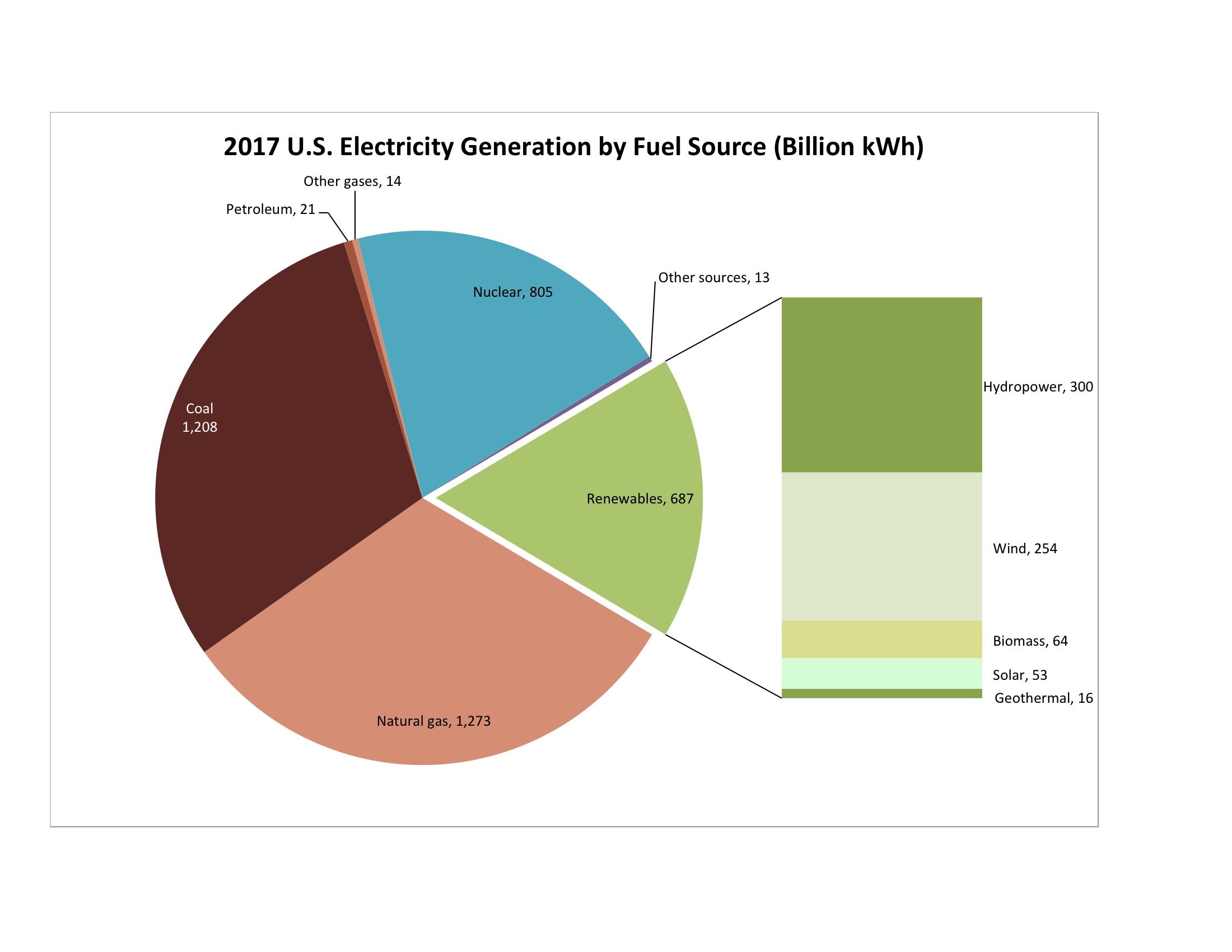
Figure 1. Data source: U.S. Energy Information Administration 2018.
about 20% of total demand. Nuclear, hydro, wind, solar, and geothermal are the sources that do not emit carbon dioxide by burning fuel, so they are desirable from climate change and pollution perspectives. Together, they accounted for about 36% of total demand. Wind and solar are intermittent sources, and that has important implications for grid reliability. Together they account for about 7% of total demand.
(Click on chart for larger view.)
.
.
.
.

Figure 2. Historical and Projected Changes in Electricity Demand. Source: North American Electrical Reliability Corporation 2017.
I described NERC, the North American Electric Reliability Corporation, in the last post. To ensure grid reliability, NERC attempts to estimate changes in demand The Grid will have to meet. Figure 2 combines historical and projected changes in demand over rolling 10-year periods from 1990 through 2027. It shows the change in demand during summer (light blue) and winter (dark blue). (In the South, demand for electricity is highest in summer, but in the North, it is highest during winter.) The columns show the change in GW (gigawatts, billions of watts) and the blue lines show the percentage compound annual growth rate.
Well, interpreting this complex graph as a little challenging, so let’s unpack it. First of all, it is a graph of change, not overall demand. So, demand for electricity has grown over every 10-year period, and it is expected to continue to do so. Second, the chart shows average annual change during each 10-year period, not cumulative change over the whole period. Third, the last period for which the data is all historical is 2007-2016. Starting with 2008-2017, some of the data is historical, some of it is projection. By 2017-2026, all of the data is projection. Fourth, the rate of demand growth accelerated in the decades starting around 2004. But fifth, the increase in demand is projected to slow in the future, in both the raw number of gigawatts and in the compound annual growth rate.
Bottom line here: The Grid is projected to have to satisfy increased demand for electricity, although the rate of growth is projected to slow.
Figure 3 shows historical additions and retirements in generating capacity supplied to The Grid, by fuel. You can see that for each type of generation, in most years, some was added and some was retired. Over the span of the chart, the net result has been a decrease in coal and nuclear generation, with an increase in natural gas, wind, and solar. Figure 4 shows similar data projected into the future. The projection shows a continuation of the trend: net retirement of coal and nuclear generating capacity, net addition of natural gas, wind, and solar. NERC projects that more natural gas generating capacity will be added than any other kind.

Figure 3. Historical Changes in Generating Capacity. Source: North American Electrical Reliability Corporation 2017.

Figure 4. Projected Future Changes in Generating Capacity. Source: North American Electrical Reliability Corporation 2017.
.

Figure 5. Source: Department of Energy 2017.
Figure 5 shows some of this data in a form that is a bit less wonkish. It shows the location, size, and type of generating station retirements on The Grid from 2002-2016 . Triangles represent power plants owned by independent power generators, while circles represent power pants owned by vertically integrated electric utilities. Grey icons represent coal burning plants, blue icons represent natural gas burning plants, and green icons represent nuclear plants. The size of the icon represents the plant’s generating capacity. Look at the concentration of gray icons in the eastern part of the country! The retirements all occurred in a 14-year period.
Many of these plants were old and inefficient, and many of them were large spewers of GHGs and other pollutants. So, from an environmental perspective, their retirement may be good news. It doesn’t take a rocket scientist, however, to see that the retirement of so many plants represents a significant transition on The Grid.
Why does this matter? Because we are looking at reliability here, not climate change. We haven’t quite developed enough information to understand the implications yet, but we will by the end of the series of posts. At this point, we can simply say that coal-based and nuclear generating stations have proven very reliable, and they fit into The Grid nicely. NERC has concerns about the reliability of natural gas, wind, and solar generating stations for the supply of bulk electricity.
Now, what about geography?
Most electricity is generated within the NERC region where it is consumed. The flow between NERC regions is comparatively small, but because The Grid has to be so finely balanced, it is important. It flows in sometimes surprising directions. The direction is determined by many factors, including the availability of transmission lines with unused capacity, historical patterns of energy consumption, and the cost of the electricity. Inexpensive electricity generated at a distance is sometimes substituted for more expensive electricity generated locally.
 The flow of energy over The Grid is shown in Figure 5 at right. The map is from 2010. The regions shown in it differ slightly from current NERC regions, and they use different names. However, it was the best representation I could find. On this map, “Midwest” = the MISO Region, “Central” = the SPP Region, “TVA” = the SERC-N Region, and “Mid-Atlantic” is roughly the PJM Interconnection Region. Let’s look a bit more closely at the map.
A region in Northern Illinois served by Commonwealth Edison belongs to the Mid-Atlantic Region, but is physically separated from it. The largest power flow in the nation occurs from this region to the rest of the Mid-Atlantic Region. This represents power that is generated by highly efficient coal and nuclear generating stations operated by Commonwealth Edison. They can’t be cycled on and off easily, so during periods of slack demand (at night) they export large amounts of power at low prices.
The second largest flow occurs from the Southwest into California. As a single state, California imports more electricity than any other.
The Midwest Region is a net exporter of power. It receives power from Manitoba and Commonwealth Edison, but it distributes even more to the TVA and Central Regions. In doing this, it participates in a counterclockwise flow from Manitoba, through the Midwest and the South, and eventually to the Mid-Atlantic Region.
The Central region is a net importer of electricity. It receives inflows from the Midwest, keeps some of it, and distributes less than it receives to Texas and the Gulf.
The amount of energy available to any region, therefore, depends mostly on the generating capacity within the region, but also on the amount it receives from other regions. The transmission of energy between regions depends not only on the need for it, but also on the availability of transmission capacity.
Sources:
Department of Energy. 2017. Staff Report to the Secretary on Electricity Markets and Reliability. Downloadedm 2018-05-19 from https://www.energy.gov/sites/prod/files/2017/08/f36/Staff%20Report%20on%20Electricity%20Markets%20and%20Reliability_0.pdf.
North American Electrical Reliability Corporation. 2017. 2017 Long-Term Reliability Assessment. Downloaded 4/27/2018 from https://www.nerc.com/pa/RAPA/ra/Pages/default.aspx.
Source: “Electricity tends to flow south in North America.” Today in Energy. EIA, http://www.eia.gov/todayinenergy/detail.cfm?id=4270.
U.S. Energy Information Administration. “U.S. Electricity Generation by Source, Amount, and Share of Total in 2017.” Frequently Asked Questions. Downloaded 4/28/2018 at https://www.eia.gov/tools/faqs/faq.php?id=427&t=3.
