Home » Climate Change
Category Archives: Climate Change
Electric Vehicles Reduce GHG Emissions, If You Live in the Right Place
In the last post, I looked at why an electric vehicle might be expected to have lower GHG emissions than a gasoline vehicle. In this post, I will look at what some studies have actually found. My original post on this subject was in 2015, and it can be found here.

Figure 1. Source: European Environment Agency, 2018.
A report published by the European Environment Agency looked at electric vehicles in Europe. This report concluded that the answer depended on the energy mix in the grid. As shown in Figure 1, an electric vehicle (BEV = Battery Electric Vehicle, specifically a Nissan Leaf) drawing electricity generated by burning coal caused the most GHG emissions of all. But Europe has a significant amount of clean energy in its grid. If that same Nissan Leaf consumed electricity that matched the average European mix, then it would have emissions about 40% less. Compared to a standard internal combustion vehicle burning gasoline, the electric vehicle would have 26-30% fewer lifetime emissions.
.
.
.
.

Figure 2. Source: Nealer, Reichmuth, and Anair, 2015.
The Union of Concerned Scientists published an analysis in 2015, almost as long ago as my original post on the subject. They focused on a “well-to-wheels” analysis. This looks at the GHGs emitted by the fuel consumed to operate the vehicle, including the GHGs emitted to obtain and produce the fuel. But it does not look at GHGs emitted to manufacture or dispose of the vehicle itself.
The study used an unusual metric for its comparison: the number of miles per gallon (MPG) that a gasoline vehicle would have to achieve in order to have emissions as low as those of an electric vehicle. Using this rather unintuitive metric, the higher the MPG a gasoline vehicle would have to achieve, the more of an advantage the electric vehicle had. Like the previous report, this study also found that the answer depended on the energy mix in the grid (see Figure 2). Where there is a lot of clean electricity in the grid, a gasoline vehicle would have to achieve up to 135 MPG to reduce its emissions to those of an electric vehicle. However, where there is mostly coal-generated electricity on the grid, a gasoline vehicle would only have to achieve 35 MPG. In 2016, the average fuel efficiency of a passenger car (SUVs and pickup trucks not included) was 37.7 MPG. (Source: Bureau of Transportation Statistics.)

Figure 3. Sourse: Nealer, Reichmuth, and Anair, 2015.
As Figure 3 shows, the study found that, assuming the average energy mix on the U.S. grid in 2015, battery electric vehicles would emit 51-53% less GHG to build and operate.
.
.
.
.
.
.
.
.
.

Figure 4: Lifetime GHG Emissions of Two Types of Car. Source: Kukrega, 2018.
A study published by the City of Vancouver compared the lifetime emissions per kilometer driven of a Ford Focus (gasoline vehicle) and a Mitsubishi i-MiEV (battery electric vehicle). The findings were presented as grams of GHG emitted per kilometer driven. As Figure 4 shows, The study found that the Ford emitted almost 400 grams of CO2e per kilometer, while the i-MiEV emitted slightly more than 200 – a 48% reduction. Now, the study was for British Columbia, and BC has a lot of clean energy in its grid.
These sources all agree: whether an electric vehicle reduces GHG emissions depends on the mix of energy that is in the electrical grid. This is the same conclusion I found when I looked at this question 4 years ago – the situation has not changed.

Figure 5. Source: Energy Information Administration.
Unfortunately, neither has the situation here in Missouri. As Figure 5 shows, we still have a grid that generates the vast majority of its electricity by burning coal. If GHG emissions are what you care about, then driving an electric vehicle here makes no sense. In other parts of the country, however, it might make a great deal of sense.
Sources
Bureau of Transportation Statistics. 2016. Average Fuel Efficiency of U.S. Light Duty Vehicles. Downloaded 9/3/2019 from https://www.bts.gov/content/average-fuel-efficiency-us-light-duty-vehicles.
Department of Energy. 2019a. Emissions from Hybrid and Plug-In Electric Vehicles. Downloaded 9/2/2019 from https://afdc.energy.gov/vehicles/electric_emissions.html.
Department of Energy. 2019b. “Find and Compare Cars.” www.fueleconomy.gov. Viewed online 9/2/2019 at https://www.fueleconomy.gov/feg/findacar.shtm.
U.S. Energy Information Administration. 2019. Missouri State Energy Profile. Downloaded 90302019 from https://www.eia.gov/state/?sid=MO#tabs-4.
European Environment Agency. 2018. Electric Vehicles from Life Cycle and Circular Economy Perspectives. Downloaded 9/2/2019 from https://www.eea.europa.eu/publications/electric-vehicles-from-life-cycle/electric-vehicles-from-life-cycle/viewfile#pdfjs.action=download.
Kukreja, Balpreet. 2018. Life Cycle Analysis of Electric Vehicles. City of Vancouver. Downloaded 9/3/2019 from https://sustain.ubc.ca/sites/sustain.ubc.ca/files/GCS/2018_GCS/Reports/2018-63%20Lifecycle%20Analysis%20of%20Electric%20Vehicles_Kukreja.pdf.
Nealer, Rachael, David Reichmuth, and Don Anair. 2015 Cleaner Cars from Cradle to Grave. Union of Concerned Scientists. Downloaded 9/2/2012 from https://www.ucsusa.org/sites/default/files/attach/2015/11/Cleaner-Cars-from-Cradle-to-Grave-full-report.pdf.
Will Electric Cars Save The World, or Is It All Marketing Hype?
There is a lot of hype about electric vehicles. On the Internet you can find articles heralding electric vehicles as world saviors, due to reduced greenhouse gas emissions (GHGs). You can also find articles purporting to debunk that idea. Then you find articles debunking the debunkers, and so forth.
In 2014, I reported on a study comparing the lifetime carbon emissions of electric vehicles vs. gasoline powered automobiles. The study concluded that whether electric vehicles produced fewer greenhouse gas emissions depended on where you lived. If you drew your energy from an electricity grid with low carbon sources of electricity (translation: not generated by burning coal), your electric vehicle would produce fewer GHG emissions than would a gasoline powered vehicle. An electric vehicle consuming electricity that came from 100% renewable sources was the lowest emitting type of all vehicles. However, if you drew your energy from a grid with high carbon sources of electricity, then an electric vehicle was perhaps the worst kind of vehicle you could own, at least from the perspective of GHG emissions. (See here for my previous post.)
It has been 4 years. Perhaps it is time to look again. In this post, I’ll look conceptually at why an electric vehicle might be expected to have lower GHG emissions than a gasoline vehicle. In the next post, I look at some studies I was able to find, and report what they had to say.
A lifetime analysis considers all of the GHGs emitted by a vehicle during its entire lifetime. Typically they divide the life of a vehicle into 3 stages. First is the manufacturing: raw materials have to be mined, transported, processed, and refined. Then they have to be manufactured into parts. Then the parts have to be transported to the assembly plant, where the vehicle is put together. All of these stages consume energy, which means they emit GHGs.
Many of the components of gasoline and electric vehicles are similar in the amount of GHG emitted during manufacture. However, one component is not: gasoline cars store their energy in gas tanks, which are not especially energy intensive to build. Electric cars, however, store their energy in lithium-ion batteries. These batteries are energy intensive to build in all phases of manufacture: obtaining the raw materials, refining it, and constructing the batteries. Thus, in terms of manufacturing, the studies I have looked at agree that it is more carbon intensive to manufacture an electric vehicle than a gasoline vehicle. However, the largest area of uncertainty in the analysis of electric vehicles involves just how much GHG is emitted by manufacturing a lithium-ion battery. Estimates disagree.
Second, the vehicle is driven by its owner or operator. In this stage, the vehicle consumes fuel. Most studies agree that the fuel consumed by a vehicle is the largest source of GHG emissions during the life of the vehicle. Burning gasoline to power an internal combustion engine is relatively energy inefficient – only a fraction of the energy is used to move the vehicle down the road, the rest gets wasted. Further, it is not particularly clean. The result is that vehicles release a lot of GHGs (and also other forms of pollution). And finally, every time the vehicle stops, all of that wonderful energy moving the car down the road is dissipated into heat by the friction of the brakes. It is just thrown away.
Electric motors are much more energy efficient than are gasoline motors. Further, when an electric vehicle stops, it can recapture some of the energy of the moving car through regenerative braking. The recovered energy gets put back into the battery, and it is used to power the car the next time it starts moving. This is the advantage hybrid cars have, and it is why they get better gas mileage than do conventional cars. A Toyota Corolla (a compact gasoline burning car) will go 36 miles on the energy in a gallon of gas. On the other hand, a Nissan Leaf, an all-electric car, will go 112 miles on an equivalent amount of energy.
Further, an electric vehicle draws its energy from the electrical grid, where there is a much greater opportunity for the energy to be clean. To oversimplify the point, renewable energy (solar, wind, and hydro) are the lowest GHG forms of energy we have. Natural gas is next, then comes oil, and worst is coal. (I’ve left nuclear out; it is low GHG-producing, but it is objectionable for other reasons.) Electrical generators can be inefficient, just like gasoline engines are. However, there is a much greater chance that some of the electricity on the grid will come from clean sources. If it comes from coal, then the electricity on which the car runs will be particularly high in GHG emissions, although they will be emitted at the power plant, not the tailpipe of the vehicle. If it has a significant mix of solar, wind, hydro, or natural gas, then it will be lower in GHG emissions.
The third step involves disposing of and/or recycling vehicle components. The studies I have read suggest that the GHGs emitted from disposing of and recycling gasoline and electric vehicles are roughly equivalent, except for that pesky lithium-ion battery. There is some hope that in the future it can be effectively recycled or reused (it will still be suitable for many uses, just not powering a car). However, this is uncertain. Thus, as in manufacturing, the GHG emissions associated with disposing of and/or recycling an electric vehicle were estimated to be higher than those for a gasoline engine.
So, the question becomes: are the GHG savings from operating an electric vehicle more than the higher emissions during manufacture and disposal? And if so, by how much?
In the next post, I’ll look at some studies that try to answer that question.
Sources
Bureau of Transportation Statistics. 2016. Average Fuel Efficiency of U.S. Light Duty Vehicles. Downloaded 9/3/2019 from https://www.bts.gov/content/average-fuel-efficiency-us-light-duty-vehicles.
Department of Energy. 2019a. Emissions from Hybrid and Plug-In Electric Vehicles. Downloaded 9/2/2019 from https://afdc.energy.gov/vehicles/electric_emissions.html.
Department of Energy. 2019b. “Find and Compare Cars.” www.fueleconomy.gov. Viewed online 9/2/2019 at https://www.fueleconomy.gov/feg/findacar.shtm.
U.S. Energy Information Administration. 2019. Missouri State Energy Profile. Downloaded 90302019 from https://www.eia.gov/state/?sid=MO#tabs-4.
European Environment Agency. 2018. Electric Vehicles from Life Cycle and Circular Economy Perspectives. Downloaded 9/2/2019 from https://www.eea.europa.eu/publications/electric-vehicles-from-life-cycle/electric-vehicles-from-life-cycle/viewfile#pdfjs.action=download.
Kukreja, Balpreet. 2018. Life Cycle Analysis of Electric Vehicles. City of Vancouver. Downloaded 9/3/2019 from https://sustain.ubc.ca/sites/sustain.ubc.ca/files/GCS/2018_GCS/Reports/2018-63%20Lifecycle%20Analysis%20of%20Electric%20Vehicles_Kukreja.pdf.
Nealer, Rachael, David Reichmuth, and Don Anair. 2015 Cleaner Cars from Cradle to Grave. Union of Concerned Scientists. Downloaded 9/2/2012 from https://www.ucsusa.org/sites/default/files/attach/2015/11/Cleaner-Cars-from-Cradle-to-Grave-full-report.pdf.
Prescribed Burning in Forests and Carbon Sequestration
Prescribed burns in forests may decrease carbon sequestration in the short term, but they increase the forest’s ability to sequester carbon in the long term.
So says a recent literature review published by the Missouri Department of Conservation.
Readers of this blog may recall that almost 3 years ago I published an 8-part series on wildfire in forests, and the role fire can have in promoting the health of the forest. Since then, I have published several updates. In that series, I reported that the Missouri Department of Conservation uses prescribed burning as a forest management tool, and it encourages private landowners to do so, too.
The literature review concludes that, though forests are complex, and general principles will not hold true for every plot within them, in the Missouri Ozarks:
- Fuel-reduction treatment (e.g. prescribed burning) reduces the risk of a large stand-destroying fire. When a whole stand is destroyed, all of the carbon sequestered in the trees is released into the atmosphere. Further, the forest is slow to regrow.
- Thinning using prescribed fire reduces competition among trees and provides additional ground nutrients, resulting in better growth.
- Forests managed with a combination of thinning and prescribed burning have lower carbon emissions than other types of forests. (Yes, they actually get out there and measure the gases emitted by different types of forest land.)
- During a prescribed burn, large trees are generally not killed by the fire, but small sprouts and herbaceous understory are. Burning the leaf litter and herbaceous understory results in a short-term increase in carbon released into the atmosphere. This is more than made-up for, however, by the increased vigor and growth of the remaining forest. The increased growth sequesters more carbon than was released in the prescribed burn.
- The soil in forests consist of a rich mixture of plant roots, moss and other vegetation, bugs, worms, microorganisms, and chemical compounds, including carbon (partially decayed remains of living things that have worked their way into the soil). There has been concern that prescribed burning would release the carbon sequestered in the soil. So far, research indicates that there is no difference in the carbon sequestration of the soil in control plots vs. plots that have had prescribed burns applied. In addition, no difference has been found between plots that are burned annually vs. plots that are burned every 4 years. The concern is understandable, but so far it appears incorrect.
- Soil respiration (the ability of oxygen to penetrate to the roots of plants) is not affected by prescribed burning.
Forests have not traditionally been managed with increased carbon sequestration as a major goal. However, the literature review seems to indicate that prescribed burning may be a technique that can lead to increased carbon sequestration in forest, through increased vigor and growth of the trees in the forest.
Source:
Ball, Liz. Undated. “The relationship between prescribed fire management and carbon storage in the Missouri Ozarks.” Missouri Department of Conservation. Downloaded 8/22/2019 from https://pdfs.semanticscholar.org/acfb/673db5694db7389e7bf7190211fb5ec75885.pdf.
The Heat Is On, the Fires Are Burning
In June of this year, Europe experienced a severe heat wave. The heat returned in July. It was the hottest it has ever been. Massive wildfires are burning in Siberia and Alaska. In St. Louis, the temperature has been normal to a bit mild for summer, but in other parts of the world, the heat is on.

Figure 1. Source: European Space Agency.
In Europe, the immediate cause of the heat was high pressure over the Sahara Desert, pushing hot air northward over Europe. The first episode occurred in late June, and Figure 1 maps temperature on June 26. Southern Europe is usually warmer than Northern Europe, and indeed, the hottest temperatures were in Spain and Italy. Sporadic places in France and Germany got very hot, too: Veragues, France, hit 114.8°F on June 28, and Brandenberg, Germany, reached 101.5°.
Buildings in Northern Europe were not built to cope with extreme heat; most do not have air conditioning. When a heat wave struck in 2003, it killed 15,000 people in France. This time, they were more prepared: 4,000 schools closed, the authorities opened public cooling rooms, and swimming pools offered extended hours. Other countries took similar actions and, as a result, only 13 died.
.

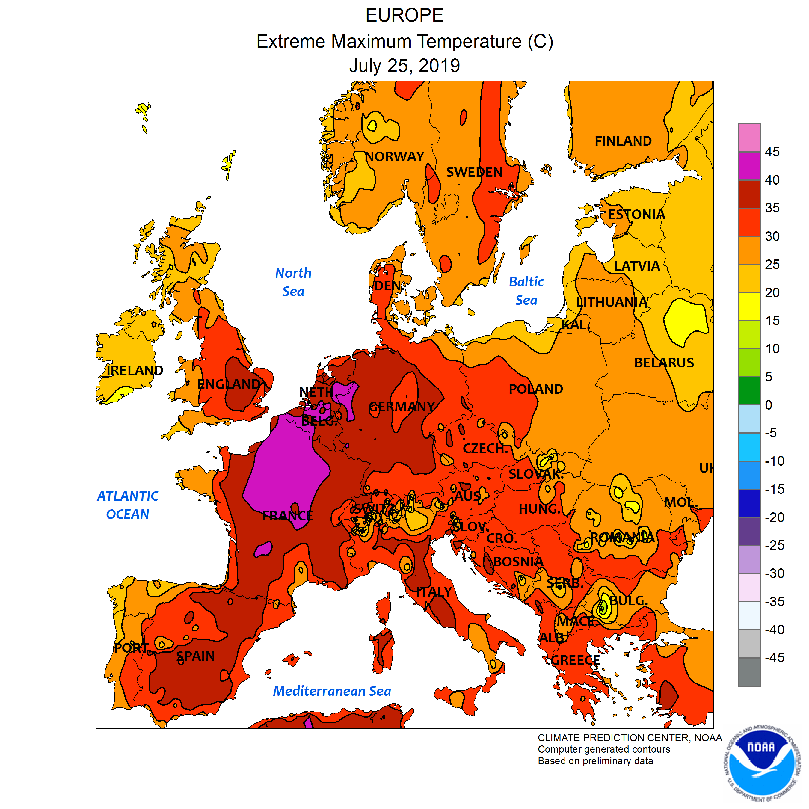
Figure 2. Source: NOAA, July 25, 2019.
In July, the heat returned (Figure 2). A large swath of Northern France, Belgium, and The Netherlands topped out between 104 and 113°F. The high temperature in Belgium was 107.2°F, exceeding the previous record by 5.4°F. Two nuclear reactors in France had to be completely shut down, and 6 more had to curtail generation due to the heat. Thousands of animals died from the heat, as ventilators in barns were overwhelmed or transport trucks overheated. England set an all-time record maximum temperature on July 25, when the temperature hit 101.7 in Cambridge.
.
.
.
.

Figure 3. Source: NASA.
The heat is causing problems outside Europe, as well. Wildfires have broken out across the Arctic. Figure 3 shows the hotspots, as seen from space. This is a polar view, and it is upside-down: the North Pole is in the center near the bottom. Alaska is on the bottom left. The Aleutian Islands are at upper left, with Siberian Russia stretching across the top 1/2 of the image. Fires that can be sensed from space are in red.
As of August 2, 48 large wildfires were actively burning in Alaska, and they have consumed 1,604,724 acres. That is 2,507 square miles, roughly equal to half of Connecticut. Only 1 is contained.
It’s even worse in Siberia. Russian authorities state that 2.7 million hectares (6.67 million acres) are actively burning. It is hard to give meaning to a statistic like that, but it is an area larger than the entire State of Connecticut. This level of fire activity is unprecedented. Originally, Russian authorities did not try to fight the fires, as they were in hard-to-reach areas. Much of Siberia is hard to reach, actually, it is part of the reason the area has not developed more. Now, however, according to the New York Times, Russia has scrambled military transport planes and helicopters to fight the fires, as smoke impacts an ever wider area, including populated cities. These fires are likely to grow even larger before they subside.
Greenland experienced a record melt event in mid-June. As you may know, Greenland is a large island in the Atlantic Ocean. It is in the far north, being the second closest land to the North Pole. It’s very large ice sheet is second in size only to that of the Antarctic, and it has been melting (one of the causes of rising sea levels). Well, the European heat wave in June caused ice to melt over 270,000 square miles of the ice sheet, resulting in an estimated 80 billion tons of ice melting between June 11 and 20, the largest ice-melt event ever recorded this early in the season.
These sorts of events are on the increase. In 2010, wildfires in Russia caused an estimated $15 billion in damage. In 2003, a heat wave in France killed an estimated 15,000. In both cases, authorities were unprepared, because such things had never happened before. What’s going on?
The answer is simple, but unpleasant: climate change.
Here comes the future.
Sources:
European Space Agency [CC BY-SA 2.0 (https://creativecommons.org/licenses/by-sa/2.0)%5D The Heat Is On. Downloaded 8/2/2019 from https://commons.wikimedia.org/wiki/File:The_heat_is_on_(48138322288).jpg.
National Interagency Fire Center. Daily Report, 8/2/2019. Viewed online 8/2/2019 at https://www.nifc.gov/fireInfo/nfn.htm.
Russian Federal Forestry Agency, quoted in NASA. Siberian Smoke Heading Towards U.S. and Canada. July 30, 2019. Viewed online 8/2/2019 at https://www.nasa.gov/image-feature/goddard/2019/siberian-smoke-heading-towards-us-and-canada.
Nechepurenko, Ivan. 2019. “Russia Sends Military Planes to Fight Wildfires in Siberia.” The New York Times, 8/1/2019. Viewed online 8/2/2019 at https://www.nytimes.com/2019/08/01/world/europe/russia-fire-siberia.html.
National Snow & Ice Data Center. “A Record Melt Event in Mid-June.” Greenland Ice Sheet Today. Viewed online 8/4/2019 at https://nsidc.org/greenland-today/2019/07/a-record-melt-event-in-mid-june.
NOAA (Public domain). July 25 2019 Europe max temperatures.png. Downloaded 8/2/2019 from https://upload.wikimedia.org/wikipedia/commons/4/49/July_25_2019_Europe_max_temperatures.png.
Wikipedia contributors, “1995 Chicago heat wave,” Wikipedia, The Free Encyclopedia, https://en.wikipedia.org/w/index.php?title=1995_Chicago_heat_wave&oldid=906011873 (accessed August 2, 2019).
Wikipedia contributors, “2010 Russian wildfires,” Wikipedia, The Free Encyclopedia, https://en.wikipedia.org/w/index.php?title=2010_Russian_wildfires&oldid=892909422 (accessed August 2, 2019).
Wikipedia contributors, “June 2019 European heat wave,” Wikipedia, The Free Encyclopedia, https://en.wikipedia.org/w/index.php?title=June_2019_European_heat_wave&oldid=908888400 (accessed August 2, 2019).
Wikipedia contributors, “July 2019 European heat wave,” Wikipedia, The Free Encyclopedia, https://en.wikipedia.org/w/index.php?title=July_2019_European_heat_wave&oldid=908883144 (accessed August 2, 2019).
Is It Cloudier Than It Used to Be?
I have had the general impression that in recent years, it has gotten cloudier. But that could be an incorrect impression, coming from the fact that, like everybody, I get older with each year. Or, it could come from the fact that my analyses for this blog have shown that there is marginally more precipitation in Missouri due to climate change. Perhaps I say “Ha!” to myself every time it is cloudy, “See, it’s because of climate change.”
Checking out one’s subjective impressions about clouds is not so easy. Clouds are very complex, and they provide the largest source of uncertainty in future climate projections. There are all kinds of clouds, and they exist at many levels of the atmosphere. Not only that, they are constantly changing: it can be overcast one moment and clear an hour later. The task of reducing this complexity to a simple measure of cloud cover has been difficult. Most weather stations do it, however. For instance, the daily climate report published by National Weather Service in St. Louis reports that for St. Louis, on July 21, 2019, the sky cover was 0.6. This means that on average for the whole day, 6/10ths (60%) of the sky was covered with clouds. (They measure the percent of the sky covered by clouds several times a day, and average the results.)
Finding a time series reporting this data over time is harder. I’ve been looking for it for some time, and I finally found it at NASA’s Giovanni Data Tool. This is a portal that provides access to satellite data for a large number of atmospheric variables, including cloud fraction. Without getting into the weeds, cloud fraction is the fraction of an area that is cloudy, roughly the same thing as sky cover, but from the sky down, rather than the ground up. The scale runs from 0, meaning none of the area was covered by clouds, to 1, which means all of the area was covered by clouds. Thus, as in the example above, 0.6 would mean that 6/10ths of the area (60%) was covered by clouds.

Figure 1: Cloud Fraction Search Area. Map Created on Google Earth.
Giovanni did not permit searching for cloud fraction by state, but it would search within a rectangle that I could define. So, as I usually do in such cases, I defined a rectangle that just barely enclosed the whole state. Figure 1 shows the search area.
.
.
.
.
.
.
.
.

Figure 2. Data source: NASA Giovanni.
Figure 2 shows the monthly cloud fraction for that rectangle from 1/1/1980, through 6/1/2019. To justify my impression that it is cloudier, you can notice that from about 2010, there has been a noticeable increase in cloud fraction. However, it is an anomaly, and the trend line, in black, shows that the cloudiness has not changed much since 1980; if anything, it has decreased a little bit, the trend line being down about 0.02 over the whole time period.
Thus, my impression was both right and wrong. I was right that, since 2010, it has gotten more cloudy over Missouri. But that hides the long-term fact that, since 1980, it has not. It is common for subjective impressions to favor recent experience over the far past, but it can hide the truth.
.
.
.

Figure 3. Data source: NASA Giovanni.
What about the Continental United States (CONUS) as a whole? Again, Giovanni wouldn’t let me search by the boundaries of the CONUS, so I searched in a rectangle that barely enclosed it. Figure 3 shows the data. Notice first that the year-to-year variation is less than for Missouri. Where cloud fraction in Missouri has bounced around between 0.2 and 0.6, cloud fraction for the CONUS has bounced around between 0.3 and 0.5. We have seen this before with other environmental data: large areas tend to average out variations in one area with opposite variations in another. However, here, too, we see the slightly declining trend in cloud fraction. The CONUS as a whole is becoming slightly less cloudy, and the difference in the trend line is about 0.02, similar to what it was for Missouri.
.
.
.
.

Figure 4. Data source: NASA Giovanni.
The world, however, shows a markedly different trend (Figure 4). Again, because it is an even larger area, the year-to-year variation is now only between 0.44 and 0.5. Don’t be fooled because Excel has spread out the y-axis. However, this time the trend is slightly up, the trend line increasing slightly less than 0.02. The world is becoming very slightly more cloudy. I don’t know for sure, but I would bet you that the increase is happening primarily over the oceans. That would be an interesting research project.
The changes are very small. However, the world has become slightly cloudier over the last 40 years, while both Missouri and the Continental United States have become slightly less cloudy.
Sources:
“Analyses and visualizations used in this article were produced with the Giovanni online data system, developed and maintained by the NASA GES DISC.” Data downloaded 7/22/2019 from https://giovanni.gsfc.nasa.gov/giovanni.
Map created with Google Earth on 7/22/2019.
Hurricane Barry, Tropical Cyclones, and Climate Change
Tropical Storm Barry formed in the Gulf of Mexico on July 11. It strengthened, and churned ashore as a Category 1 hurricane in western Louisiana on July 13. It weakened, and moved northward, causing rain in Arkansas and here in Missouri.

Figure 1. Data source: Landsea, downloaded 2019.
As Figure 1 shows, land-falling hurricanes in July are uncommon, though not unknown: there have been 26 in the 167 years that records have been kept. That’s one every 6.4 years. It seems like a good time to ask whether climate change has been affecting tropical cyclones?
.
.
.
.
.
.

Figure 2. Source: Weather.gov.
Why might we expect climate change to affect tropical cyclones? To answer that question, you have to understand the “engine” that drives a tropical cyclone (see Figure 2). Tropical cyclones get their energy from warm, humid air on the surface of the ocean. Convection causes the warm, humid air to rise, and as it does so, it enters cooler regions of the atmosphere. This causes the humid air to condense into clouds and rain (often thunderstorms). Condensation is an exothermic process – that means that the water gives off heat as it condenses. The heat keeps the humid air rising, condensing more water, and giving off more heat. This process continues. As the air rises, it leaves an empty place where it used to be, so more air rushes in from the sides to take its place. If this air is also warm and humid, then it will rise, too, and condense into rain. If this process strengthens, then the air rises faster and faster, and the air moving in to take its place moves faster and faster. The air begins to rotate, and presto, you have your tropical cyclone.
The energy that drives all of this is the warm humid air on the surface of the ocean. Thus, it is easy to understand that anything that causes the air on the surface of the ocean to be warmer and more humid can provide more energy to a storm that might form.
What if, over the decades, the water in the oceans got warmer? Well, it would make the air above it warmer. It would also evaporate into the air more effectively, as we all know that warm water evaporates more quickly than does cold water. So warming oceans would seem to be a perfect recipe for providing more energy to tropical cyclones, making them more intense. Climate change is projected to cause the oceans to warm, and this brings us to the first article I wanted to report.
Multiple studies have reported that the heat content of the oceans has been rising. The IPCC 5th Assessment Report put the rate at 0.20-0.32 watts per square meter. However, there were many uncertainties. A recent article by Cheng, Abraham, Hausfather, and Trenberth (2019) reports that since the 5th Assessment Report, scientists have made progress in identifying and resolving the uncertainties. They review 3 studies that incorporated the advances, and find that the rate has actually been 0.36-0.39 watts per square meter. Compared to the IPCC estimate, that represents an increase of somewhere between 0.04-0.19 watts per meter.
Doesn’t sound like much, does it? The oceans are huge, however, 361,900,000 square kilometers, which translates to 361,900,000,000,000 square meters. So, the increase represents an increase of 14,476,000 – 68,761,000 megawatts. The Callaway Nuclear Generating Station in Missouri is rated at 1,190 megawatts, so the increase is equal to 12,164 – 57,782 Callaway Nuclear Generating Stations. That’s a lot of heat!
So, have tropical cyclones become more severe? Well, that is really two questions. One involves wind speed, the other involves rainfall amounts. Too many other factors affect wind speed and rainfall amounts to permit a simple comparison across storms. There is no scientific consensus regarding how climate change has affected tropical cyclones, or how it may do so in the future.
Patricola and Wehner (2019) recently published a study where they modeled the wind speed and rainfall in a suite of 15 tropical cyclones from around the world under different climates. Thus, this study doesn’t really prove anything. Rather, it clarifies what kind of effects our current theories might predict. From coolest to warmest they simulated pre-industrial climate, historical climate, RCP 4.5, RCP 6.0, and RCP 8.5. (The RCPs are standardized emission scenarios used to project the effects of climate change. The terms 4.5, 6.0, and 8.5 represent the level of radiative forcing caused by climate change. All are projected to be warmer than current climate.) They then made comparisons between the models.

Table 1. Source: Patricola and Wehner, 2018.
Table 1 presents the results for peak wind speed measured for at least 10 minutes. The 1st column lists the name of the storm. The 2nd column gives the difference between the result of the historical and pre-industrial models. The 3rd column gives the difference between the result of the RCP 4.5 and historical models. The 4th column gives the difference between the result of the RCP 6.0 and historical models. The 5th column gives the difference between the result of the RCP 8.5 and historical models. The 6th column gives the wind speed projected by the historical model. The 7th column gives the wind speed as it was actually observed in the real storm.
Remember that the goal here is not to actually predict wind speed, but to understand the kind of effects our climate models project. The average difference in wind speed projected for RCP 4.5 vs. historical climate was 6.7 knots. The average difference in wind speed projected for RCP 6.0 vs. historical climate was 7.8 knots. The average difference in wind speed projected for RCP 8.5 vs. historical climate was 13.0 knots. Thus, for those comparisons, the hotter the climate scenario, the higher the wind speed. The outlier was for pre-industrial climate. Being cooler, the pre-industrial climate scenario should have resulted in lower wind speeds than the historical climate, yet the projection resulted in higher wind speed. Why, I’m not sure.

Table 2. Source: Patricola and Wehner, 2018.
Table 2 presents the results for rainfall. The average difference in rainfall projected for RCP 4.5 vs. historical climate was 10.9 inches. The average difference in rainfall projected for RCP 6.0 vs. historical climate was 13.5 inches. The average difference in rainfall projected for RCP 8.5 vs. historical climate was 18.4 inches. Here, pre-industrial climate was not an outlier: the average rainfall projected for pre-industrial climate was 5.8 inches less than for historical climate.
Thus, the study shows that modeling projects that climate change will result, on average, in more rainfall per storm. The trend was linear and consistent, and no storm bucked the trend. For wind speed, results were less consistent.
Hurricane Harvey was a great example of what is projected for rain. The storm parked itself over Houston and Eastern Texas, dropping 40 inches of rain in some areas, causing extensive flooding.
But what about Hurricane Barry? It’s storm path initially projected that it would come very close to New Orleans, and it would dump 15-20 inches of rainfall. Would there be another Katrina-like disaster?
The reality turned out to be much less dire. The storm came ashore west of New Orleans, and though there were some spots that received heavy rain, most areas received much less. According to the official weather service reports from New Orleans, Baton Rouge, and Shreveport, between July 1 and July 15 they received 3.66 inches, 4.41 inches, and 0.42(!) inches. It sounds like most of the rain came from scattered thunderstorms associated with Barry, not from a widespread downpour.
Sources:
Cheng, Lijing, John Abraham, Zeke Hausfather, and Keven E. Trenberth. 2019. “How fast are the ocearns warming?” Science. Vol 363 (6423), pp. 128-129. Downloaded 1/20/2019 from http://science.sciencemagazine.org.
Landsea, Chris. “Frequently Asked Questions: How many hurricanes have there been in each month?” Atlantic Oceanographic & Meteorological Laboratory. Data downloaded 7/16/2019 from https://www.aoml.noaa.gov/hrd/tcfaq/E17.html.
National Centers for Environmental Information. “Volume of the World’s Oceans from ETOPO1.” Viewed online 7/15/2019 at https://ngdc.noaa.gov/mgg/global/etopo1_ocean_volumes.html.
National Weather Service Forecast Office, New Orleans/Baton Rouge, LA. Daily Climate Report.Viewed online 7/16/2019 at https://w2.weather.gov/climate/index.php?wfo=lix.
National Weather Service Forecast Office, Shreveport, LA. Daily Climate Report. Viewed online 7/16/2019 at https://w2.weather.gov/climate/index.php?wfo=shv.
Patricola, Christina M. and Michael F. Wehner. 2018. “Anthropogenic Influences on Major Tropical Cyclone Events.” Nature. 563, 11/15/18., pp. 339-346.
Weather.gov. “Hurricane Facts”. Downloaded 7/16/2019 from https://www.weather.gov/source/zhu/ZHU_Training_Page/tropical_stuff/hurricane_anatomy/hurricane_anatomy.html.
Wikipedia contributors, “Hurricane Barry (2019),” Wikipedia, The Free Encyclopedia, https://en.wikipedia.org/w/index.php?title=Hurricane_Barry_(2019)&oldid=906405193 (accessed July 15, 2019).
Wikipedia contributors, “Tropical cyclone,” Wikipedia, The Free Encyclopedia, https://en.wikipedia.org/w/index.php?title=Tropical_cyclone&oldid=906385211 (accessed July 15, 2019).
Western USA Snowpack and Reservoirs
I last reported on the snowpack and reservoirs in California and the Colorado River Basin at the end of January. At that time, the snowpack had gotten off to a slow start. Boy, did things change!
Most of the western USA has a monsoonal precipitation pattern: most of the rain falls during the winter, and from about March through the end of November, there usually isn’t much precipitation. For that reason, the entire region depends on stored water, either in reservoirs, or perhaps even more importantly, in the snowpack that builds up on the mountains. Because I have family in California, and because the long-term predictions for the water supply in the West have been grim, I have been following the status of the snowpack and the reservoirs in California and the Colorado River Basin. The most important measurement for the snowpack is usually around April 1, while maximum levels on the reservoirs typically occur some weeks later, as the snowpack melts. For instance, Lake Powell, the uppermost very large reservoir on the Colorado River, reaches its highest monthly average in July. Lake Shasta, the largest reservoir in California, reaches its highest average level in May.
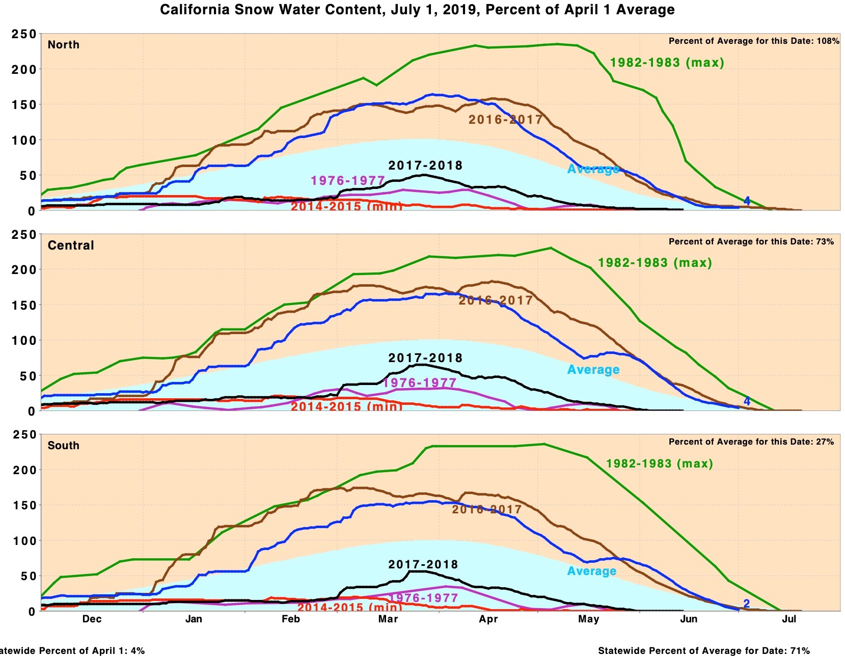
Figure 1. Source: California Department of Water Resources, 2019a.
Figure 1 shows the snow water content of the snowpack in California. (The snow water content represents how much water there would be if you melted the snow in a given location. For instance, if you melted 7 inches of snow, it might only represent 1 inch of water.) The 3 charts represent the 3 major snowpack regions of California. The dark blue line is for 2019, while the light blue area represents average. The units along the y-axis represent percent of the April 1 average.
You can see that 2019 had an above average snowpack, maxing out at more than 150% of average in all 3 regions. By this time of year, the snowpack has largely melted. Notice the text at the bottom right: “Statewide Percent of Average for Date: 71%.” Despite having a snowpack that maxed out at 150% of average, the amount of snowpack remaining on this date is less than average. This illustrates another way that climate change is affecting California: temperatures are up, and the snowpack is melting more rapidly than in the past.

Figure 2. Source: Mammoth Mountain Ski Area, 2019.
I use Mammoth Mountain to illustrate snowfall amounts; it is located in the middle-south of the Sierra Nevada Mountains, south of Yosemite. Their website indicates that they are still open with 15” at the main lodge and 55” at the summit – on July 4th! Figure 2 shows snowfall at Mammoth Mountain by year and month. Paralleling the snowpack survey, this chart shows that 2019 was well above average at Mammoth, but not a record. There was one month with a lot of snow: February.
.
.
.
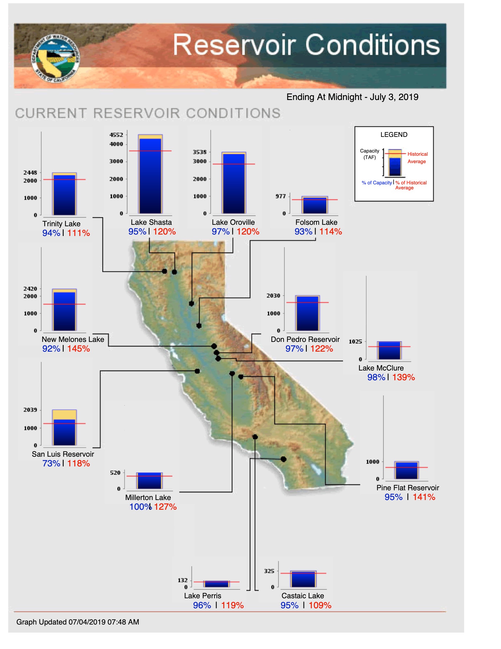
Figure 3. Source: California Department of Water Resources, 2019b.
As a result, California’s reservoirs are all above average for this date, as shown in Figure 3. Even lake Oroville, which had to be mostly emptied when the dam eroded, threatening catastrophic failure, is nearing capacity. Every single reservoir is above average, and only one is not near capacity.
Many western states, including Southern California, are heavily dependent on water from the Colorado River. Lake Mead is the largest reservoir, and it is capable of holding more water than any other in the USA. For a couple of decades, there has been concern that water demands on the Colorado River had increased, and water supply into it had decreased, to the point that Lake Mead would be drained within a couple of decades. Over the last 5 years, water levels were so low that they flirted with the mandatory cut-back level: states would have lost a significant portion of their water.
.
.
.
Figure 4 shows that snowpack in the Upper Colorado River Basin was higher than average in 2019, and this represents the 2nd time in the last 3 years. This snow melts into a number of reservoirs along the tributaries of the Colorado River, and then into Lake Powell, the first of the gigantic reservoirs along the Lower Colorado River Basin. From Lake Powell, it is released into Lake Mead. Figure 5 shows that Lake Mead is up from its record low a few years ago, but it is still historically very low.

Figure 4. Source: water-data.com, 2019b.

Figure 5. Source: water-data.com, 2019a.
The bottom line here is that the draught has finally broken in California, and that state is sitting on plenty of water for now. This was to be expected – nobody ever thought that California’s water supply problem would be a straight line from full to empty. The regions history, however, indicates that draught is a normal occurance for the state, and in recent years, wet periods have not lasted too long. The whole point of reservoirs is that they get drawn down during dry periods. So long as they get refilled before they are empty, the system is working just like it should. Three things can break the system, though: first, if water demand increases too much, and there just isn’t enough water to satisfy the demand. California is getting close to outstripping supply, as is all of the West. Second, wet years could get less wet, and then they might not be sufficient to refill the reservoirs. This year was sufficient to refill the California reservoirs, but Lake Mead still has a long way to go! And finally, if too many years go by before a wet one comes along, then the reservoirs could get sucked dry. California was getting close, and Santa Barbara, in particular, got really, really close.
The long term projection is still guarded, as population continues to enter western states and climate change continues to threaten the snowpack. How it will unfold year-by-year is anybody’s guess, but for now, things are better than they were a couple of years ago.
Sources:
California Department of Water Resources. 2019a. Current Reservoir Conditions. Downloaded 7/4/2019 from http://cdec.water.ca.gov/reportapp/javareports?name=rescond.pdf.
California Department of Water Resources. 2019b. California Snow Water Content, July 1, 2019, Percent of April Average. Downloaded 7/4/2019 from http://cdec.water.ca.gov/reportapp/javareports?name=PLOT_SWC.pdf.
water-data.com. 2019. Lake Mead Water Levels, All Time. Downloaded 7/4/2019 from http://graphs.water-data.com/lakemead.
water-data.com. 2019. Lake Mead Water Level: Averages by Month. Downloaded 7/4/2019 from http://lakepowell.water-data.com/index2.php.
water-data.com. 2019. Upper Colorado Basin Snowpack (Actual Values). Downloaded 7/4/2019 from http://graphs.water-data.com/ucsnowpack.
Mammoth Mountain Ski Area. 2019. Extended Snow Report. Downloaded 7/4/2019 from https://www.mammothmountain.com/winter/mountain-information/mountain-information.
The World’s Thinning Glaciers
Glaciers around the world are melting. Millions of people around the world who depend on them are likely to be impacted.
One of the signs of climate change that has received the most attention is the shrinking of glaciers around the world. Sometimes it is presented as a cause of sea level change, but it has only a minor effect on sea level. The Greenland Ice Cap and the Antarctic Ice Cap are far larger bodies of ice, and they will (and already do) contribute more to rising sea levels than do all the glaciers around the world. Further, much of the predicted rise in sea level is due to nothing more than the thermal expansion of water. You know, things expand as they heat up. Well, the oceans are projected to heat up only a little, but there is so much of them that expansion contributes significantly to the rise in sea level.
Melting glaciers matter for a different reason: people depend on them for water. Glaciers form the headwaters of many of the world’s rivers, great and small. Not meaning to make a comprehensive list, in Asia, the Indus, the Ganges, the Brahmaputra, the Yangtze, the Huang-ho (Yellow), and the Oxus all arise from glacial melt. In Europe, the Danube, the Rhine, and the Po all receive substantial glacial melt. In South America, the Madeira (largest tributary of the Amazon) receives glacial melt from about 1,000 miles of the east slope of the Andes. Finally, in North America, the Missouri, Columbia, Snake, Yukon, McKenzie, and Fraser Rivers all receive significant glacial melt.

Figure 1. Source: Schaner, Voisin, Nijssen, and Lettenmaier, 2012.
Figure 1 is a map indicating river basins for which at least 5% (green), 10% (yellow) 25% (orange), and 50% (red) of discharge is derived from glaciers in at least one month. (The “at least one month” qualification matters – glaciers melt much more during the warmer months of the year). Notice that one of the 2 largest blotches of color is located along the northwest coast of North America. This is a high mountain region that is very far north and close to an ocean: a perfect recipe for glaciers. The other is located in Central Asia, where the highest mountains in the world are located, and which receive the famous monsoons of India.
.
.
.
.
.

Table 1. Source: Schaner, Voisin, Nijssen and Lettenmaier, 2012.
Table 1 shows the number of people and the land area that depend on glacial melt. Considering the world as a whole, an estimated 120 million people depend on rivers that get 50% or more of their water from glacial melt (1.8% of the world’s population). About 600 million people depend on rivers that get 5% or more of their water from glaciers (8.9%of the world’s population). So, we are talking about substantial numbers of people. Should the earth’s glaciers decline substantially, some of these people would be likely to lose access to water entirely, at least for part of the year. For others, important life-sustaining activities, such as agriculture or transportation, would be curtailed.
.
.
.

Figure 2. Source: WGMS, 2017, updated, and earlier reports.
So what is the status of the world’s glaciers? Sadly, it is not good! The World Glacier Monitoring Service (WGMS) is a joint project of the World Data System, the International Association of Cryospheric Sciences, the United Nations Environment Program, the United Nations Education, Scientific, and Cultural Organization, and the World Meteorological Organization. The WGMS studies and monitors the world’s glaciers, and serves as a repository for data on them. They have a set of 30 glaciers around the world that have been repeatedly measured for at least the last 30 years (some much longer), with few or no gaps. Figure 2 shows the status of these 30 glaciers. The year is represented on the x-axis, and the change in mass is represented on the y-axis. The units on the y-axis are meter water equivalents, which are equal to metric tons per square meter of surface. Thus, in 2015, the year of greatest loss, these 30 glaciers collectively lost about 1.1 metric tons of ice per square meter of surface. When you consider that the earth has hundreds, if not thousands, of glaciers, then it becomes clear that we are talking about a lot of ice that is melting into water.
.

Figure 3. Source: WGMS, 2017, updated, and earlier reports.
Many of these glaciers are hundreds or thousands of feet thick, and the loss in mass represents thinning of the glacier (melting from the top or bottom) every bit as much as it represents retreat (melting at the bottom end of the glacier). Figure 3 shows the cumulative loss in mass of these same 30 glaciers since 1950. Don’t be confused by the early values above 0 – the glaciers have been losing mass throughout, but for some reason, the WGMS set 1976 as zero, not 1950.
.
.
.
.

Figure 4. Source: WGMS, 2017, updated, and earlier reports.
The reference glaciers are concentrated in North America and Europe more than in other continents. However, consider Figure 4, which shows the cumulative mass lost by region. Western Canada/USA and Central Europe have had greater loss than any other regions. However, all regions have had significant loss, including Svalbard and Jan Mayen (3rd worst), and Asia Central (4th worst).
I thought I would illustrate the global nature of the retreat with reference to a few very well known glaciers. Though not necessarily the largest or most important, they are famous.
.
.
.

Figure 5. Mt. Everest and the Khumbu Glacier. Source: NASA 2011.
To represent Asia, I chose the Khumbu Glacier. Located in Nepal, this is the glacier of Mt. Everest. Base camp sits on it; climbers walk up it and through the Khumbu Ice Fall (where the glacier pours over a cliff), before starting their ascent of the mountain itself. It was measured 3 times: 1970, 2000, and 2016. Between 1970 and 2000, it thinned by an average of 300 cm. (9.8 feet) per year. Between 2000 and 2016, it thinned faster, by an average of 500 cm. (16.4 ft.) per year. (The surface of most glaciers collect dust and debris, thus parts of the glaciers turn brown or gray.)
.
.
.
.
.
.

Figure 6 Photo by John May, 2015.
To represent Europe, I chose the Mer de Glace, the famous glacier just east of Mt. Blanc (and the 2nd largest in Europe). The first measurement of the Mer de Glace was in 1570. I told you some of these measurements went back more than 30 years! By the early 1600s, the front of the glacier had advanced by about 1,000 meters. It then varied until the late 1800s, when it began retreating. By the early 2000s, the front of the glacier had retreated about 1,000 meters from its 1570 location, and about 2,000 meters from its location during the mid-1800s. Meanwhile, the thickness of the glacier was measured in 1980, 2003, and 2012. Between 1980 and 2003, it thinned at a rate of about 18-20 mm. per year (0.06-0.065 ft.) Between 2003 and 2012, the thinning accelerated to about 160 mm. per year (0.5 ft.).

Figure 7. Source: NASA.
To represent North America, I chose the Muir Glacier: the photos of its retreat are as dramatic as any around the world. It was first measured in 1880, and since then its front has retreated about 29,000 meters (95,144 ft. or 18 miles). The photos in Figure 7 were taken in 1941 and 2004, and show about 7 of those 18 miles of retreat.
I’ve discussed what climate change and snowpack loss in the Northern Rockies might mean for the water supply in the Missouri River, and those who want to explore that topic can find the post here.
Glacial loss matters in some locations more than others. A very large number of people are likely to be affected, especially in Asia. Those people often live at a subsistence level; what loss of the glaciers will mean to them is hard to know. What kind of famine, pestilence, migration, political instability, and war might result is anybody’s guess.
Sources:
NASA. 2011. Adapted from ”everest_ali_2011298_geo.tif.” Downloaded 2019-07-01 from https://visibleearth.nasa.gov/view.php?id=82578.
NASA. “Graphic: Dramatic Glacier Melt.” Global Climate Change. Downloaded 6/24/2019 from https://climate.nasa.gov/climate_resources/4/graphic-dramatic-glacier-melt.
Schaner, Neil, Nathalie Voisin, Bart Nijssen, and Dennis P. Lettenmaier. 2012. “The Contribution of Glacier Melt to Streamflow.” Environmental Research Letters. 7 034029. Downloaded 6/24/2019 from https://iopscience.iop.org/article/10.1088/1748-9326/7/3/034029.
WGMS. 2019. WGMS Flucuations of Glaciers Browser. Data accessed online 6/24/2019 at https://www.wgms.ch/fogbrowser.
WGMS (2017, updated, and earlier reports): Global Glacier Change Bulletin No. 2 (2014-2015). Zemp, M., Nussbaumer, S. U., Gärtner-Roer, I., Huber, J., Machguth, H., Paul, F., and Hoelzle, M. (eds.), ICSU(WDS)/IUGG(IACS)/UNEP/UNESCO/WMO, World Glacier Monitoring Service, Zurich, Switzer- land, 244 pp., based on database version: doi:10.5904/wgms-fog-2018-11. Downloaded 6/24/2019 from https://wgms.ch/global-glacier-state. (While this is the citation the source document suggests, the graphs used in this post were updated in January, 2019.)
No Decline in Missouri Crop Yields (Yet)
There have been some recent articles about how climate change is harming agriculture. One by Kim Severson in the New York Times (here) says “Drop a pin anywhere on a map of the United States and you’ll find disruption in the fields.” It goes on to discuss the impacts on “11 everyday foods”: tart cherries (Michigan), organic raspberries (New York), watermelons (Florida), chickpeas (Montana), wild blueberries (Maine), organic heirloom popcorn (Iowa), peaches (Georgia and South Carolina), organic apples (Washington), golden kiwi fruit (Texas), artichokes (California), and rice (Arkansas).
Well, that is a sampling of foods from around the country. I’m not so sure how “everyday” many of them are, but rice is certainly one of the basic grains.
A somewhat more convincing article by Chris McGreal in The Guardian interviewed farmers in valley of the Missouri River near Langdon, in northwestern Missouri. These are corn and soybean farmers. Their problem has been moisture: they have had too much rain. In many years, the ground has been so muddy that crops were ruined or not planted at all. In other years, the rain has caused the water table to rise so much that the ground looks dry on top, but is mucky mud just a few inches down. This is something, of course, that would affect river valleys the most, and the big river valleys in Missouri are some of the richest farmland the state has.

Figure 1. Data source: National Agriculture Statistics Service, USDA.
Most climate change studies project that climate change will impact agriculture negatively. Given this blog’s focus on the large statistical perspective, I thought it might be interesting to see how crop yields are doing in Missouri. The United States Department of Agriculture publishes the data. This data is a statistical average of yields across Missouri. Results in any one location may be different.
Figure 1 shows the per-acre yield for corn. The data shows that corn yields vary significantly from year-to-year, and that some years are really terrible, with yields being roughly half of what they are in good years. That said, there is a clear trend toward increased yields from 1957 right through 2014. Yields since then have been lower, and it is possible that we are looking at the start of a downward trend, but 4 years is not sufficient to tell.

Figure 2. Data source: National Agricultural Statistics Service, USDA.
Figure 2 shows the per-acre yield for soybeans. The yearly variation here may be somewhat less, but the overall pattern is much the same. With soybeans, however, yields increased right through 2017.
This data doesn’t tell us why crop yields are rising. Perhaps they are due to improved farming practices and better seed stock. It is possible that warmer temperatures, an increase in carbon dioxide, and more rain have benefitted crop yields overall, even if they have hurt some farmers in some locations. We just don’t know, at least not from this data.
What we do know is that, overall, the predicted negative effects of climate change do not yet seem to be reducing yields in these two important crops.
Sources:
McGreal, Chris. 2018. “As Climate Change Bites in America’s Midwest, Farmers Are Desperate to Ring the Alarm.” The Guardian,” 12/12/2018. Viewed online 5/1/2018 at https://www.theguardian.com/us-news/2018/dec/12/as-climate-change-bites-in-americas-midwest-farmers-are-desperate-to-ring-the-alarm.
Severson, Kim. 2019. “From Apples to Popcorn, Climate Change Is Altering the Foods America Grows.” The New York Times, 4/30/2019. Viewed online 5/1/2019 at https://www.nytimes.com/2019/04/30/dining/farming-climate-change.html?rref=collection%2Fsectioncollection%2Fclimate&action=click&contentCollection=climate®ion=rank&module=package&version=highlights&contentPlacement=2&pgtype=sectionfront.
National Agriculture Statistics Service, United States Department of Agriculture. Quick Stats. This is a data portal that can be used to build a customized report. I focused on yield, in bushels per acre, for corn and soybeans from 1957-2018. Data downloaded 5/1/2019 from https://quickstats.nass.usda.gov.
Missouri Weather-Related Deaths, Injuries, and Damages in 2017

Figure 1. Data source: Office of Climate, Water, and Weather Services, National Weather Service.
Damage from severe weather in Missouri shows a different pattern than does damage nationwide. As Figure 1 shows, the cost of damage from hazardous weather events in Missouri spiked in 2007, then spiked even higher in 2011. Since then, it has returned to a comparatively low level. The bulk of the damage in 2011 was from 2 tornado outbreaks. One hit the St. Louis area, damaging Lambert Field. The second devastated Joplin, killing 158, injuring 1,150, and causing damage estimated at $2.8 billion. The damages in 2007 came primarily from two winter storms, one early in the year, one late. In both cases, hundreds of thousands were without power, and traffic accidents spiked.
.
.

Office of Climate, Water, and Weather Services, National Weather Service.
Figure 2 shows deaths and injuries in Missouri from hazardous weather. Deaths are in blue and should be read on the left vertical axis. Injuries are in red and should be read on the right vertical axis. The large number of injuries and deaths in 2011 were primarily from the Joplin tornado. In 2006 and 2007, injuries spiked, but fatalities did not. The injuries mostly represented non-fatal auto accidents from winter ice storms. The fatalities in 1999 resulted from a tornado outbreak.
I understand the trends in both figures this way: once in a while, Missouri has been struck with catastrophic weather events. They cause lots of deaths and a lot of damage, at a whole different scale from years with no catastrophic weather event. In years with no such event, weather-related deaths in Missouri have been around 40 or fewer, and injuries have been roughly 400 or fewer. Damages in such years have been about $150 million or less. In years with catastrophic weather events, the totals can be much higher.
2017 was a year in which Missouri saw no weather disasters that caused such high damages, or killed or injured so many people. That does not mean that Missouri was unaffected, however. The state was included in several billion-dollar weather disasters, the most costly of which was probably the flood of April 25-May 7. That was a historic flood for many of the communities that were affected.
The Missouri data covers fewer years than the national data discussed in my previous post. It also covers all hazardous weather, in contrast to the national data, which covered billion dollar weather disasters only. In addition, for some reason the Missouri data for 2018 has not yet been posted.
While the national data shows a clear trend towards more big weather disasters, Missouri’s data does not. The Missouri data seems to reflect the kind of disaster and where it occurred. Tornadoes, if they hit developed areas, cause injuries, deaths, and lots of damage. Floods cause fewer injuries and deaths; damage can be significant, but it is limited to the floodplain of the river that flooded. Ice storms affect widespread areas; damages come mostly through loss of the electrical grid, which can cause widespread economic loss and from car crashes, which cause many injuries but fewer deaths.
Sources:
Office of Climate, Water, and Weather Services, National Weather Service. 2016. Natural Hazard Statistics. Data for Missouri downloaded at various dates from https://www.nws.noaa.gov/om/hazstats.shtml#.
CPI inflation Calculator. 2019. 2017 CPI and Inflation Rate for the United States. Data downloaded 4/6/2019 from https://cpiinflationcalculator.com/2017-cpi-and-inflation-rate-for-the-united-states.
National Centers for Environmental Information. 2019. Billion-Dollar Weather and Climate Disasters: Table of Events. Viewed online 4/6/2019 at https://www.ncdc.noaa.gov/billions/events/US/1980-2018.
Descriptions of specific weather events, if they are large and significant, can be found on the websites of the Federal Emergency Management Administration, the Missouri State Emergency Management Agency, and local weather forecast offices. However, in my experience, the best descriptions are often on Wikipedia.

.jpg)