Subscribe to posts:

The End
This blog has been an almost 7-year, deep dive into material that is heavy and depressing, but it has been fascinating, and I have learned so much! I have tried to share some of what I’ve learned with you, and I hope that it has been interesting and informative.
I started writing this blog because, years ago, a friend of mine was running for public office, and he asked me to inform him about the environment in Missouri. I started writing him a series of white papers. As I worked, I found that the media generally follows environmental activism or specific environmental problems. It rarely presents an overall assessment of the environment, especially broken down by state. Information about Missouri was not easy to find. I had to dig, but I discovered that amazing information was there if you could just find it.
One of my great hopes for this blog has been that it would help guide others to the resources I discovered.
On a personal level, my wife was diagnosed with cancer in November 2012. She lived for almost 6 years before losing her battle. There were many times when she felt well, and we did many amazing things together during that time. But there were also periods when she was ill, and the blog was something I could do when she did not want me to “hover,” but I did not feel I should leave her alone.
The blog’s first post went live in January 2013. It was about the Greenhouse Gas Inventory that Missouri conducted in 1990. Once upon a time Missouri was an environmental leader – imagine that! Since then, there have been 370 posts. More than 41,000 pages have been viewed by more than 24,000 separate viewers. Really popular blogs get tens of millions of views every month. I never expected the blog to grow big; it’s about statistics, after all, and most people are not fond of statistics. If you told me at the beginning that I would have written material viewed 41,000 times by 24,000 people, I would have been very pleased.
Each post takes, on average, 10-12 hours to write. I have to read and understand the studies and reports, I have to download the data and massage it into a form that fits this format, and I have to write the text. Now, it is time for me to stop. The blog will continue to exist for a couple of months going forward, and perhaps even beyond that. Though I will no longer be adding new posts, the old ones will still be there, and they will still be full of good information. They will continue to point the way to the original sources for those who want to dive deeper.
Thank you so much for the opportunity to write for you. Best wishes.

Tree At Sunset. Photo by John May
Global Brain or Global Cancer?
I was once asked by someone why I had named my blog after Moe Greene, an incidental character in The Godfather. Hmm. This blog focuses on environmental statistics related to Missouri. Hence the name Mo-green-stats. For the most part, I have stuck to that theme, only deviating a few times. This post is one of the deviations.
I want to share with you my perspective on humanity as it relates to Earth’s environment. Overall perspectives like this aren’t meant to be fully accurate. They only work with respect to some characteristics. With regard to those characteristics, however, they can be illuminating, and provide a quick way to sum-up complex issues. In short, don’t take what follows literally, but rather as a darkly evocative vision.
My perspective originates from Peter Russel’s The Global Brain. (It’s a book and a video. The book is available through Amazon, and you can find the video on YouTube. There are other works with the same name by other authors. Be sure you get the one by Peter Russel.) It presented two views of the role of humanity. Russel was a proponent of the Gaia Hypothesis – the idea that the Earth itself is a self-regulating entity, a unitary whole with many parts, that is analogous to a single living organism. Russel noted the way humans have built electronic data processing and communication systems around the world, and the way we have organized and brought more and more systems of the globe under control. He thought that in animals, those were functions performed by the nervous system, especially the brain. He wondered if human beings could be regarded as the Earth’s brain – a global brain, hence the title of his book.
He also noted, however, that we had proliferated without limit, and the rate was increasing. He noted how we had displaced other species from their locations and environmental niches. He noted how we seemed to consume an ever larger share of the Earth’s resources, converting more and more of the Earth to satisfy our needs, and he noted how we polluted and poisoned the planet with our waste. He wondered if, instead of a brain, we were actually a cancer.
He concluded that the ensuing decades would make clear which we were.
It has been 47 years since the publication of his book. The electronic, communication, computer, and artificial intelligence trends he noticed have done nothing but accelerate, and his view of an interconnected world has become more and more true. At the same time, however, the overpopulation, displacement of species, consumption of resources, and pollution of the planet have also done nothing but accelerate. Perhaps both are true. Perhaps we are both the global brain and the global cancer – the global brain cancer.
The analogy between humanity and a cancer brings certain characteristics into focus. Cancer starts as normal tissue. Take a colon cancer, for instance. When we are born, we start off as just a few undifferentiated cells. As we gestate, more and more cells accumulate, and they begin to differentiate. Some become brain cells, some lung cells, some heart cells, some colon cells, and so forth. The body has ways of controlling all this.
Like all cells, the colon cells of the young individual seek to nourish themselves, grow, and replicate. As they do, a colon grows in the fetus until it becomes an intact, functioning organ. The body has ways of controlling all this.
The colon cells stay only in the colon. They don’t migrate to the head and fill your head with colon. They don’t go to your foot and fill your foot with colon. The body has ways of ensuring that they stay right where they should.
After birth, the child continues to grow, and the child’s colon does, too. The growth of the colon keeps pace with the growth of the individual. At some point, the individual reaches full size, and he/she stops growing. Amazingly, the colon does too. The body has ways of managing all this.
But when colon cells become a cancer, something happens. One or more colon cells escape the regulation of the body. Outside the body’s control, they do what all cells seek to do, only they do it without limit: they start replicating like crazy. They grow and grow, when they shouldn’t. As they do, they recruit more resources from the body to fuel their growth, and they excrete toxins which damage the tissue around them, providing more room for growth.
Pretty soon, they have filled all the space in their immediate vicinity, killing or pushing aside other cells. When all the space has been taken, they burst out into the rest of the body. This is called metastasis. Once out in the rest of the body, they travel to distant locations, places where they have no business being, and set up colonies there.
The original cancer grows, and the metastases grow. They convert more and more of the body’s resources to fuel their growth, depriving the other organs of the resources they need. And they put-out more and more toxins, slowly poisoning the other organs of the body. Being deprived of needed nutrition and poisoned by toxins, the host body weakens. Eventually, it gets to be too much, and the host dies. When the host dies, the cancer dies too; somehow, it never thought of that beforehand.
Similarly, humans started out as a few individuals of a specific and unique type, like cells of an organ. Our population grew slowly, but only to a point. We filled an ecological niche, doing our part to contribute to the overall balance, what Disney popularized as the Circle of Life. Like cells, we wanted to nourish ourselves, grow, and multiply. But the Earth had ways of holding our numbers down and keeping us in our place, and for a long time our population remained low, and we stayed in our niche. Do you see the parallel with normal colon cells?
At some point, however, we escaped the Earth’s control, and we began to multiply like crazy. As we did, we began converting the resources of the areas around us to serve our needs and nourish our growth. We displaced other species, and we began producing all manner of waste which polluted and poisoned the land and the waters. Just like a cancer.
At some point, we filled up all the living space around us, and we burst out into the rest of the world. Just like a metastasizing cancer, humans spread to the far reaches of the globe, often to places that are hostile to human life, places where you might say we didn’t really belong.
The population of our original settlements grew, and the population of the places we colonized grew. Like a metastasized cancer, we converted more and more of the earth’s resources to fuel our growth. Like a metastasized cancer, we produced more and more toxins, poisoning more and more of the planet. The Earth is weakening, and I have documented many of the ways in this blog.
Eventually, it will get to be too much, and our host, The Earth, will suffer a severe decline in its ability to support life (its equivalent of dying). When the Earth dies, just like the cancer, we too will die. Somehow, we won’t have managed to think of that beforehand.
It’s a dark vision. Most people like to think of mankind as, in the words of the old Jefferson Airplane song, the “crown of creation,” unique in the universe, fashioned in the image of God. To see humans as none of that, to see us as a global cancer, is quite a “come down.” What a bummer!
What would we do if we stopped seeing ourselves as the crown of creation, and started seeing ourselves as a global cancer? What if, in addition to seeing all of the triumphs of mankind as advancements, we also came to see them as the relentless progress of a deadly cancer? It would make a lot of things look very different!
It is such an uncomfortable perspective! And yet, I can’t help feeling that it is important for us to step outside the grandiose view of mankind. We need to wonder if all of our triumphs are really such good news, after all.
.
.
This is my second-to-last post on Mogreenstats. I will be summing up and ending the blog next week.
.
Sources
Russel, Peter. Undated. The Global Brain. Video originally published in Viewed online 9/30/2019 at https://www.youtube.com/watch?v=B1sr9x263LM.
Russel, Peter. 1983. The Global Brain: Speculations on the Evolutionary Leap to Planetary Consciousness. Los Angeles: J.P. Tarcher. This and also more recent editions with slightly different names are available on Amazon.
Abandoned Mine Lands 2019 – 3
The previous two posts have reported on the amount of abandoned mine land in Missouri and neighboring states, how much of it is high priority, how much of it has been reclaimed, and how much remains to be reclaimed.
Coal has been one of the world’s most important industrial fuels, and for most of the last 100 years it has been the primary fuel from which we generate electricity. One of the reasons America grew to be an economic powerhouse was because we had abundant energy resources, and coal was one of them. As of 2015, West Virginia, Kentucky, Illinois, and Pennsylvania were the largest producing eastern coal states, in that order. Because their coal is high in sulfur, however, some coal production moved to the West, where the coal is lower in sulfur. Wyoming is now the nation’s largest coal producer, producing 39% of the nation’s coal in 2015.

Figure 1. Source: Office of Surface Mining, Reclamation, and Enforcement, 2017.
Missouri is a coal producing state, though our production has been small compared to some other high producing states. As Figure 1 shows, a significant portion of the state is underlain by coal. The majority of the coal veins are thin, however, and tend to be high in sulfur. Thus, coal mining never became the huge industry it did in some other states.
.
.
.
.
.
.

Figure 2. Source: Office of Surface Mining, Reclamation, and Enforcement, 2017.
Coal mining began in Missouri in the 1840s. It peaked in 1984, when almost 7 million tons were mined. But since then, production has trended lower, and 233,898 tons were mined in 2016, a small fraction of peak production. In contrast, Wyoming mined 387.9 million tons, hundreds of times more. Figure 2 shows the trend since 1994. Currently, the coal used to generate Missouri electricity is about 90% Wyoming coal, 10% Missouri coal.
Other kinds of mining began in Missouri even earlier, as early as the 1740s. At one time, Missouri was the primary source of lead in the United States. As many as 67,000 acres of unreclaimed land were abandoned by the coal industry, and 40,000 acres by other mining operations.
Missouri’s land reclamation program was established by state law in 1974, when the Department of Natural Resources was created. But it got a big boost with the passage of the federal Surface Mining Control and Reclamation Act in 1977. This law provides minimum requirements for mines, funding, and oversight of state reclamation efforts.
As we saw in the previous post, some states have an abandoned mine land problem many times greater than does Missouri, and their reclamation efforts receive higher levels of funding than does ours. Funding has varied from year-to-year with budgetary woes and shifting priorities. But Missouri and other states have been working to reclaim abandoned mine lands since the 1970s. As we saw in the two previous posts, abandoned mine lands are classified into 3 broad categories. Lands that pose an extreme danger to health and welfare are classified Priority 1, and lands that pose a threat to health and welfare are classified as Priority 2. Land that has been degraded by mining operations, but which is not a threat to health and welfare, is classified as Priority 3. Priority 1 and 2 lands are classified as high priority. The law requires their reclamation before Priority 3 lands are addressed. In addition, the law requires abandoned coal mining land to be addressed before other types of abandoned mine lands, I’m not quite sure why.
Since the 1970s, mining operations have been required to obtain state permits in order to operate. Miners must pay a fee for the permit, and place a bond with the state, and they are required to reclaim their land when mining operations finish. Should they fail to reclaim the land, the bond is forfeited, and the funds are used by the state for its reclamation efforts. Because there is less coal mining in Missouri, fees collected by the Department of Natural Resources have decreased, and this is one reason that the funds available for reclamation have also decreased. (Missouri Department of Natural Resources, 2014)
As reported in the previous 2 posts, Missouri has made significant progress in reclaiming its abandoned mine land. But it is a very, very big and expensive job. Because the units to be reclaimed can be of so many different types, and because funding levels control the rate of reclamation, I think that estimated costs may give the best picture of what’s been accomplished and what remains to be done. By cost, Missouri has completed about 1/3 of its work to reclaim Priority 1 and 2 land. However, that does not include Priority 3 land. In 2017, Missouri accomplished $449,009 worth of reclamation work on Priority 1 & 2 lands. Given that there are $108,977,143 in uncompleted Priority 1 & 2 reclamation costs, at that rate, it will take Missouri 243 years to complete reclamation on Priority 1 and 2 land. Unfortunately, not all abandoned mine lands have been inspected. As they are inspected, unless Missouri devotes more resources to the job, the time to completion is likely to grow.
Sources:
U.S. Energy Information Administration. 2015. Frequently Asked Questions: Which states produce the most coal? http://www.eia.gov/tools/faqs/faq.cfm?id=69&t=2. Viewed 4/16/2015.
Alton Field Division, Office of Surface Mining Reclamation and Enforcement. 2017. Annual Evaluation Report for the Regulatory Program and the Abandoned Mine Land Program Administered by the State Regulatory Authority of Missouri, For Evaluation Year 2017. U.S. Department of the Interior. https://www.odocs.osmre.gov.
Missouri Department of Natural Resources. 2014. 2012-2013 Land Reclamation Program Biennial Report. http://dnr.mo.gov/pubs.
Missouri Department of Natural Resources. 2016. 2014-2015 Land Reclamation Program Biennial Report. http://dnr.mo.gov/pubs.
Missouri Department of Natural Resources. 2018. 2016-2017 Land Reclamation Program Biennial Report. http://dnr.mo.gov/pubs.
Abandoned Mine Lands 2019 – 2
The amount of dangerous highwall in Missouri spiked in 2017, leading to a large increase in uncompleted high priority abandoned mine units needing reclamation.
The previous post concerned the total inventory of abandoned mine lands in Missouri. This post focuses on high priority abandoned mine lands: those that pose a threat to public health and safety (Priority 2), and those that pose an extreme danger to public health and safety (Priority 1). The law requires Missouri to reclaim high priority lands before low priority lands.

Table 1. Data source: Office of Surface Mining, Reclamation, and Enforcement.
Table 1 shows the data for September 2019, August 2017, April 2015, and April 2014. Completed units increased across each time, as one would want. However, uncompleted units grew between 2014 and 2015, and then spiked between 2015 and 2017 by 384%. This resulted in a similar pattern for total units: they increased between 2014 and 2015, and spiked between 2015 and 2017, before decreasing slightly between 2017 and 2019.
Reviewing the categories of hazards (not shown), most categories increased modestly between 2015 and 2017. However, units of dangerous highwall increased from 11,350 to 160,924. There are several possible reasons for such a drastic change. I cut and paste my data from the frederal database, and I have made several checks with the e-AMLIS database to ensure I did not make an error, and I don’t think I did. There may have been a change in the way units of highwall are counted that is not described in the database information, or Missouri could have inspected mine lands that had not been previously inspected, resulting in the discovery of additional dangerous highwall, or known highwall that was not dangerous may have become dangerous during the period.
Completed costs have also grown at each date, indicating the reclamation work that has been completed. Uncompleted costs, however, have grown even more quickly, from $14 million in 2014 $109 million in 2019 – they are almost 8 times what they were in 2014. I’m sure the change partially results from better estimates of what the costs will actually be, combined with inflation. Whether those factors account for the total change, I don’t know.

Figure 1. Data source: Office of Surface Mining, Reclamation, and Enforcement.
Figure 1 shows the number of Priority 1 and 2 units for Missouri and 4 neighboring states. Blue represents completed, and red represents uncompleted. Don’t forget that a unit can be acres of spoiled land, individual buildings or structures, hazardous bodies of water, vertical openings, or lengths of dangerous highwall, so one cannot directly translate number of units to environmental threat or cost to reclaim.
.
.
.
.
.

Figure 2. Data source: Office of Surface Mining, Reclamation, and Enforcement.
Figure 2 shows the estimated costs to reclaim Priority 1 and 2 sites for those same states. Blue represents completed work, red represents uncompleted. Because funding appears to be the most important factor limiting reclamation efforts, this chart may be a more informative representation of the amount of work accomplished so far, and the amount yet to do. It shows that in terms of costs, Missouri has completed a little bit more than 1/3 of the work required to reclaim its high priority sites. Arkansas has completed about 2/3, Illinois a bit more than 1/2, and Iowa not quite 1/2. Kansas, on the other hand, has completed about 6% of the work. They are just getting started.
Pennsylvania is the state with the largest amount of abandoned mine land, and the state with the largest reclamation challenge. They have more than 10 times as many Priority 1 and 2 units as does Missouri, and the estimated cost to reclaim them is $3.9 billion. West Virginia has the second most: $1.8 billion.

Figure 3. Data source: Office of Surface Mining, Reclamation, and Enforcement.
Figure 3 shows changes in the number of uncompleted units (blue) and uncompleted costs (red). Between 2015 and 2017, all 5 states experienced a small increase in the number of high priority units. Similarly, all but Kansas experienced an increase in estimated costs (inflation alone will cause about a 2% increase each year). Kansas experienced a small decrease. Why Illinois experienced such a large increase, I don’t know.
In my next post, I will report on some other interesting facts in the most recent reports on abandoned mine lands.
Sources:
Office of Surface Mining Reclamation and Enforcement. e-AMLIS Database. U.S. Department of the Interior. Downloaded 9/20/2019 from https://amlis.osmre.gov/QueryAdvanced.aspx.
For other abandoned mine land sources, see previous post.
Abandoned Mine Lands 2019-1
The amount of abandoned mine land needing reclamation has grown every year I have looked at it.

Office of Surface Mining and Reclamation e-AMLIS data system.
Despite reclamation efforts, between August 2017, and September 2019, the number of units of abandoned mine land in Missouri increased by 0.88% according to a federal database (e-AMLIS). The data is shown in Figure 1: the top chart is for the number of units of mine land that need to be reclaimed, the center chart is for the number of acres that need to be reclaimed, and the bottom chart is for the costs to reclaim them. Blue represents land on which reclamation has been completed, red represents land funded for reclamation but not completed, and green represents land awaiting funding for reclamation.
(Click on graphic for larger view.)
Mines create environmental hazards if efforts are not made to prevent it. The hazards range from piles of material that can leach hazardous substances, to clogged streams, to polluted or hazardous water bodies, to vertical openings into which victims can fall, to dangerous walls, dams, and structures that can collapse.
The federal government keeps an inventory of identified abandoned mine lands, the e-AMLIS Database. There can be several units at one abandoned mine site. For instance, one might be a pile of tailings, another might be an abandoned building, and a third might be a highwall. The units of mine land in the statistics may refer to acres of spoiled land, number of unsafe structures, or linear lengths of unsafe highwall. You can’t translate directly from units to acres of land, but for reporting purposes, the government does make the conversion (called GPRA), and this is what I’m reporting as acres.

Figure 2. Source: Office of Surface Mining and Reclamation, e-AMLIS data system.
Figure 2 shows the location of abandoned mine lands in the e-AMLIS inventory in Missouri and in nearby regions of neighboring states. “Why,” a thoughtful reader might ask, “are these lands in southwestern and north-central Missouri? Isn’t the “lead belt” in southeastern Missouri?” Yes, of course it is. But these are surface lands, mostly from coal mining, and these are the locations where that kind of mining occurred.
These statistics apply only to abandoned mine land that has been inventoried. Not all of Missouri’s abandoned mine lands have been inventoried, and I don’t know the status of the uninventoried land. Since the 1970s, mine operators have been required to restore mine land when mining operations cease. Compliance is enforced through a bonding system. Most of Missouri’s abandoned mine lands result from mines abandoned before the law took effect. The Missouri Land Reclamation Authority estimates that as many as 107,000 acres of mine lands have been abandoned in Missouri, about 0.2% of the entire state. Since 1970, when a mine operator abandons the land, they forfeit their bond, and the state uses that money, plus appropriations and grants from the federal government, to reclaim the land. The decline of mining in Missouri has resulted in lower bond holdings, reducing the money available for reclamation.
During FY 2017, Missouri reclaimed 1.7 acres of dangerous piles or embankments, 1,099 linear feet of dangerous highwall, and 30 acres of polluted or hazardous water bodies. Over the history of the reclamation program, 37% of the high priority units have been reclaimed (more on that in the next post), but an estimated $107,509,643 of reclamation work remains unfunded. At 2017’s rate of funding, it will be 73 years before the work is finished. The last time I looked at this data, in August 2017, the time to complete the work was 83 years. Mine reclamation is a costly, long-term project.
The law requires that abandoned coal mines be reclaimed before other abandoned mines, and it requires that high priority lands be reclaimed before low priority lands. Priority 1 lands (those posing an extreme danger to public health and safety) and Priority 2 lands (those posing a threat to public health and safety) are high priority. Priority 3 lands (those involving the restoration of land previously degraded by mining) are low priority. More on high priority abandoned mine lands in the next post.
Sources:
Historical data for this post came from previous posts on this topic. For the most recent, see here. Current data came from published reports and a federal database. The majority of the most recent data and the map were downloaded from:
Office of Surface Mining Reclamation and Enforcement. Abandoned Mine Land Inventory System (e_AMLIS). Data downloaded 9/17/2019 from https://amlis.osmre.gov/QueryAdvanced.aspx.
Additional current data plus historical information and descriptions of the program were obtained from:
Alton Field Division, Office of Surface Mining Reclamation and Enforcement. 2017. Annual Evaluation Report for the Regulatory Program and the Abandoned Mine Land Program Administered by the State Regulatory Authority of Missouri, for Evaluation Year 2017. U.S. Department of the Interior. Downloaded 9/18/2019 from https://www.odocs.osmre.gov.
Missouri Department of Natural Resources. Undated. 2015–2016 Land Reclamation Program Biennial Report. https://dnr.mo.gov/pubs/documents/pub2726.pdf.
Electric Vehicles Reduce GHG Emissions, If You Live in the Right Place
In the last post, I looked at why an electric vehicle might be expected to have lower GHG emissions than a gasoline vehicle. In this post, I will look at what some studies have actually found. My original post on this subject was in 2015, and it can be found here.

Figure 1. Source: European Environment Agency, 2018.
A report published by the European Environment Agency looked at electric vehicles in Europe. This report concluded that the answer depended on the energy mix in the grid. As shown in Figure 1, an electric vehicle (BEV = Battery Electric Vehicle, specifically a Nissan Leaf) drawing electricity generated by burning coal caused the most GHG emissions of all. But Europe has a significant amount of clean energy in its grid. If that same Nissan Leaf consumed electricity that matched the average European mix, then it would have emissions about 40% less. Compared to a standard internal combustion vehicle burning gasoline, the electric vehicle would have 26-30% fewer lifetime emissions.
.
.
.
.

Figure 2. Source: Nealer, Reichmuth, and Anair, 2015.
The Union of Concerned Scientists published an analysis in 2015, almost as long ago as my original post on the subject. They focused on a “well-to-wheels” analysis. This looks at the GHGs emitted by the fuel consumed to operate the vehicle, including the GHGs emitted to obtain and produce the fuel. But it does not look at GHGs emitted to manufacture or dispose of the vehicle itself.
The study used an unusual metric for its comparison: the number of miles per gallon (MPG) that a gasoline vehicle would have to achieve in order to have emissions as low as those of an electric vehicle. Using this rather unintuitive metric, the higher the MPG a gasoline vehicle would have to achieve, the more of an advantage the electric vehicle had. Like the previous report, this study also found that the answer depended on the energy mix in the grid (see Figure 2). Where there is a lot of clean electricity in the grid, a gasoline vehicle would have to achieve up to 135 MPG to reduce its emissions to those of an electric vehicle. However, where there is mostly coal-generated electricity on the grid, a gasoline vehicle would only have to achieve 35 MPG. In 2016, the average fuel efficiency of a passenger car (SUVs and pickup trucks not included) was 37.7 MPG. (Source: Bureau of Transportation Statistics.)

Figure 3. Sourse: Nealer, Reichmuth, and Anair, 2015.
As Figure 3 shows, the study found that, assuming the average energy mix on the U.S. grid in 2015, battery electric vehicles would emit 51-53% less GHG to build and operate.
.
.
.
.
.
.
.
.
.

Figure 4: Lifetime GHG Emissions of Two Types of Car. Source: Kukrega, 2018.
A study published by the City of Vancouver compared the lifetime emissions per kilometer driven of a Ford Focus (gasoline vehicle) and a Mitsubishi i-MiEV (battery electric vehicle). The findings were presented as grams of GHG emitted per kilometer driven. As Figure 4 shows, The study found that the Ford emitted almost 400 grams of CO2e per kilometer, while the i-MiEV emitted slightly more than 200 – a 48% reduction. Now, the study was for British Columbia, and BC has a lot of clean energy in its grid.
These sources all agree: whether an electric vehicle reduces GHG emissions depends on the mix of energy that is in the electrical grid. This is the same conclusion I found when I looked at this question 4 years ago – the situation has not changed.

Figure 5. Source: Energy Information Administration.
Unfortunately, neither has the situation here in Missouri. As Figure 5 shows, we still have a grid that generates the vast majority of its electricity by burning coal. If GHG emissions are what you care about, then driving an electric vehicle here makes no sense. In other parts of the country, however, it might make a great deal of sense.
Sources
Bureau of Transportation Statistics. 2016. Average Fuel Efficiency of U.S. Light Duty Vehicles. Downloaded 9/3/2019 from https://www.bts.gov/content/average-fuel-efficiency-us-light-duty-vehicles.
Department of Energy. 2019a. Emissions from Hybrid and Plug-In Electric Vehicles. Downloaded 9/2/2019 from https://afdc.energy.gov/vehicles/electric_emissions.html.
Department of Energy. 2019b. “Find and Compare Cars.” www.fueleconomy.gov. Viewed online 9/2/2019 at https://www.fueleconomy.gov/feg/findacar.shtm.
U.S. Energy Information Administration. 2019. Missouri State Energy Profile. Downloaded 90302019 from https://www.eia.gov/state/?sid=MO#tabs-4.
European Environment Agency. 2018. Electric Vehicles from Life Cycle and Circular Economy Perspectives. Downloaded 9/2/2019 from https://www.eea.europa.eu/publications/electric-vehicles-from-life-cycle/electric-vehicles-from-life-cycle/viewfile#pdfjs.action=download.
Kukreja, Balpreet. 2018. Life Cycle Analysis of Electric Vehicles. City of Vancouver. Downloaded 9/3/2019 from https://sustain.ubc.ca/sites/sustain.ubc.ca/files/GCS/2018_GCS/Reports/2018-63%20Lifecycle%20Analysis%20of%20Electric%20Vehicles_Kukreja.pdf.
Nealer, Rachael, David Reichmuth, and Don Anair. 2015 Cleaner Cars from Cradle to Grave. Union of Concerned Scientists. Downloaded 9/2/2012 from https://www.ucsusa.org/sites/default/files/attach/2015/11/Cleaner-Cars-from-Cradle-to-Grave-full-report.pdf.
Will Electric Cars Save The World, or Is It All Marketing Hype?
There is a lot of hype about electric vehicles. On the Internet you can find articles heralding electric vehicles as world saviors, due to reduced greenhouse gas emissions (GHGs). You can also find articles purporting to debunk that idea. Then you find articles debunking the debunkers, and so forth.
In 2014, I reported on a study comparing the lifetime carbon emissions of electric vehicles vs. gasoline powered automobiles. The study concluded that whether electric vehicles produced fewer greenhouse gas emissions depended on where you lived. If you drew your energy from an electricity grid with low carbon sources of electricity (translation: not generated by burning coal), your electric vehicle would produce fewer GHG emissions than would a gasoline powered vehicle. An electric vehicle consuming electricity that came from 100% renewable sources was the lowest emitting type of all vehicles. However, if you drew your energy from a grid with high carbon sources of electricity, then an electric vehicle was perhaps the worst kind of vehicle you could own, at least from the perspective of GHG emissions. (See here for my previous post.)
It has been 4 years. Perhaps it is time to look again. In this post, I’ll look conceptually at why an electric vehicle might be expected to have lower GHG emissions than a gasoline vehicle. In the next post, I look at some studies I was able to find, and report what they had to say.
A lifetime analysis considers all of the GHGs emitted by a vehicle during its entire lifetime. Typically they divide the life of a vehicle into 3 stages. First is the manufacturing: raw materials have to be mined, transported, processed, and refined. Then they have to be manufactured into parts. Then the parts have to be transported to the assembly plant, where the vehicle is put together. All of these stages consume energy, which means they emit GHGs.
Many of the components of gasoline and electric vehicles are similar in the amount of GHG emitted during manufacture. However, one component is not: gasoline cars store their energy in gas tanks, which are not especially energy intensive to build. Electric cars, however, store their energy in lithium-ion batteries. These batteries are energy intensive to build in all phases of manufacture: obtaining the raw materials, refining it, and constructing the batteries. Thus, in terms of manufacturing, the studies I have looked at agree that it is more carbon intensive to manufacture an electric vehicle than a gasoline vehicle. However, the largest area of uncertainty in the analysis of electric vehicles involves just how much GHG is emitted by manufacturing a lithium-ion battery. Estimates disagree.
Second, the vehicle is driven by its owner or operator. In this stage, the vehicle consumes fuel. Most studies agree that the fuel consumed by a vehicle is the largest source of GHG emissions during the life of the vehicle. Burning gasoline to power an internal combustion engine is relatively energy inefficient – only a fraction of the energy is used to move the vehicle down the road, the rest gets wasted. Further, it is not particularly clean. The result is that vehicles release a lot of GHGs (and also other forms of pollution). And finally, every time the vehicle stops, all of that wonderful energy moving the car down the road is dissipated into heat by the friction of the brakes. It is just thrown away.
Electric motors are much more energy efficient than are gasoline motors. Further, when an electric vehicle stops, it can recapture some of the energy of the moving car through regenerative braking. The recovered energy gets put back into the battery, and it is used to power the car the next time it starts moving. This is the advantage hybrid cars have, and it is why they get better gas mileage than do conventional cars. A Toyota Corolla (a compact gasoline burning car) will go 36 miles on the energy in a gallon of gas. On the other hand, a Nissan Leaf, an all-electric car, will go 112 miles on an equivalent amount of energy.
Further, an electric vehicle draws its energy from the electrical grid, where there is a much greater opportunity for the energy to be clean. To oversimplify the point, renewable energy (solar, wind, and hydro) are the lowest GHG forms of energy we have. Natural gas is next, then comes oil, and worst is coal. (I’ve left nuclear out; it is low GHG-producing, but it is objectionable for other reasons.) Electrical generators can be inefficient, just like gasoline engines are. However, there is a much greater chance that some of the electricity on the grid will come from clean sources. If it comes from coal, then the electricity on which the car runs will be particularly high in GHG emissions, although they will be emitted at the power plant, not the tailpipe of the vehicle. If it has a significant mix of solar, wind, hydro, or natural gas, then it will be lower in GHG emissions.
The third step involves disposing of and/or recycling vehicle components. The studies I have read suggest that the GHGs emitted from disposing of and recycling gasoline and electric vehicles are roughly equivalent, except for that pesky lithium-ion battery. There is some hope that in the future it can be effectively recycled or reused (it will still be suitable for many uses, just not powering a car). However, this is uncertain. Thus, as in manufacturing, the GHG emissions associated with disposing of and/or recycling an electric vehicle were estimated to be higher than those for a gasoline engine.
So, the question becomes: are the GHG savings from operating an electric vehicle more than the higher emissions during manufacture and disposal? And if so, by how much?
In the next post, I’ll look at some studies that try to answer that question.
Sources
Bureau of Transportation Statistics. 2016. Average Fuel Efficiency of U.S. Light Duty Vehicles. Downloaded 9/3/2019 from https://www.bts.gov/content/average-fuel-efficiency-us-light-duty-vehicles.
Department of Energy. 2019a. Emissions from Hybrid and Plug-In Electric Vehicles. Downloaded 9/2/2019 from https://afdc.energy.gov/vehicles/electric_emissions.html.
Department of Energy. 2019b. “Find and Compare Cars.” www.fueleconomy.gov. Viewed online 9/2/2019 at https://www.fueleconomy.gov/feg/findacar.shtm.
U.S. Energy Information Administration. 2019. Missouri State Energy Profile. Downloaded 90302019 from https://www.eia.gov/state/?sid=MO#tabs-4.
European Environment Agency. 2018. Electric Vehicles from Life Cycle and Circular Economy Perspectives. Downloaded 9/2/2019 from https://www.eea.europa.eu/publications/electric-vehicles-from-life-cycle/electric-vehicles-from-life-cycle/viewfile#pdfjs.action=download.
Kukreja, Balpreet. 2018. Life Cycle Analysis of Electric Vehicles. City of Vancouver. Downloaded 9/3/2019 from https://sustain.ubc.ca/sites/sustain.ubc.ca/files/GCS/2018_GCS/Reports/2018-63%20Lifecycle%20Analysis%20of%20Electric%20Vehicles_Kukreja.pdf.
Nealer, Rachael, David Reichmuth, and Don Anair. 2015 Cleaner Cars from Cradle to Grave. Union of Concerned Scientists. Downloaded 9/2/2012 from https://www.ucsusa.org/sites/default/files/attach/2015/11/Cleaner-Cars-from-Cradle-to-Grave-full-report.pdf.
Prescribed Burning in Forests and Carbon Sequestration
Prescribed burns in forests may decrease carbon sequestration in the short term, but they increase the forest’s ability to sequester carbon in the long term.
So says a recent literature review published by the Missouri Department of Conservation.
Readers of this blog may recall that almost 3 years ago I published an 8-part series on wildfire in forests, and the role fire can have in promoting the health of the forest. Since then, I have published several updates. In that series, I reported that the Missouri Department of Conservation uses prescribed burning as a forest management tool, and it encourages private landowners to do so, too.
The literature review concludes that, though forests are complex, and general principles will not hold true for every plot within them, in the Missouri Ozarks:
- Fuel-reduction treatment (e.g. prescribed burning) reduces the risk of a large stand-destroying fire. When a whole stand is destroyed, all of the carbon sequestered in the trees is released into the atmosphere. Further, the forest is slow to regrow.
- Thinning using prescribed fire reduces competition among trees and provides additional ground nutrients, resulting in better growth.
- Forests managed with a combination of thinning and prescribed burning have lower carbon emissions than other types of forests. (Yes, they actually get out there and measure the gases emitted by different types of forest land.)
- During a prescribed burn, large trees are generally not killed by the fire, but small sprouts and herbaceous understory are. Burning the leaf litter and herbaceous understory results in a short-term increase in carbon released into the atmosphere. This is more than made-up for, however, by the increased vigor and growth of the remaining forest. The increased growth sequesters more carbon than was released in the prescribed burn.
- The soil in forests consist of a rich mixture of plant roots, moss and other vegetation, bugs, worms, microorganisms, and chemical compounds, including carbon (partially decayed remains of living things that have worked their way into the soil). There has been concern that prescribed burning would release the carbon sequestered in the soil. So far, research indicates that there is no difference in the carbon sequestration of the soil in control plots vs. plots that have had prescribed burns applied. In addition, no difference has been found between plots that are burned annually vs. plots that are burned every 4 years. The concern is understandable, but so far it appears incorrect.
- Soil respiration (the ability of oxygen to penetrate to the roots of plants) is not affected by prescribed burning.
Forests have not traditionally been managed with increased carbon sequestration as a major goal. However, the literature review seems to indicate that prescribed burning may be a technique that can lead to increased carbon sequestration in forest, through increased vigor and growth of the trees in the forest.
Source:
Ball, Liz. Undated. “The relationship between prescribed fire management and carbon storage in the Missouri Ozarks.” Missouri Department of Conservation. Downloaded 8/22/2019 from https://pdfs.semanticscholar.org/acfb/673db5694db7389e7bf7190211fb5ec75885.pdf.
One-Quarter of the World’s Population Faces High Water Stress; Arizona and Nevada Face Mandatory Water Cutbacks
“17 Countries, Home to One-Quarter of the World’s Population, Face Extremely High Water Stress.”

Figure 1: Overall Water Risk. Source: World Resources Institute.
So says the title of a report issued recently by the World Resources Institute (WRI). Behind the florid headline lies a somewhat more complex, but still very dangerous, reality.
Figure 1 maps the overall water stress. This is a statistic that combines 13 different kinds of water risks into one summary statistic. Thus, the color coding on the map does not translate directly to a physical measure of any specific threat, but rather represents the level of threat from all combined. The report discusses the risks individually, and they can be mapped using the Aqueduct tool available at the WRI. They are:
Quantity Risks Quality Risks Regulatory Risks
Baseline water stress Untreated wastewater Unimproved/no drinking water
Baseline water depletion Coastal eutrophication Unimproved/no sanitation
Groundwater table decline Peak RepRisk country EST risk
Interannual variability
Seasonal variability
Drought risk
Riverine flood risk
Coastal flood risk
.
You can see that large swaths of Africa, the Middle-East, India, and China face extremely high risk. Those who read the environmental sections of the news may recall that Chennai, India (a city of over 7 million, formerly called Madras) is currently facing a severe water crisis. This city of over 7 million people reached “Day Zero” in June, when the reservoirs ran dry, and the city water company could no longer provide water. The rich pay exorbitant rates for water that is privately trucked in from hundreds of miles away, but average people get a small allocation (less than 8 gallons per day) that is brought in by the government, and they have to walk long distances to distribution points. The temperature just now in Chennai is ranging from a low of 80 to a high of 92, and the humidity is near 90%. Can you imagine living in that heat with only 8 gallons of water every day?
Those with slightly longer memories may remember that Cape Town, South Africa, faced a similar situation last year. Reservoirs hovered at 15-30% of capacity. Had levels reached 13.5% of capacity, the water company would have turned off deliveries, and people would have had to queue for water, just as in Chennai. Heavy monsoons in the summer of 2018 partially refilled the reservoirs, and “Day Zero” has been forestalled for the time being.
In both cases, the water crises were slow motion train wrecks, building slowly over years. Mismanagement and failure to perform upkeep on the water infrastructure played a role, but the primary culprit was increased population. Cape Town’s population grew from 2.4 million in 1995 to 4.1 million in 2015, an increase of 71%. Chennai’s population grew from under 1 million in 1941 to 4.3 million in 2001, and then exploded to 7 million in 2011. These population increases represented huge increases in demand, and supplies did not keep up. In both cases, however, the crises themselves were triggered by severe drought. A drought can cause the supply of water to plummet. If a region consumes almost all of its water supply, when a drought starts, the region can very suddenly find itself in a serious shortage. If the drought persists, the region will drain its reserves, and then the taps will go dry.
Given that population continues to increase, and climate change is predicted to cause longer, more severe droughts, it is a situation we are likely to see more often in the future.

Figure 2: Baseline Water Stress. Source: World Resources Institute.
Most regions of the United States are somewhat less vulnerable to pollution and eutrophication, and have access to sanitation and treated potable water. Thus, for Figure 2, I have chosen a map of Baseline Water Stress for the Continental United States, which measures total water consumption compared to total renewable water availability. On this map, Extremely High means the region consumes more than 80% of its renewable water supply, High means it consumes 40-80%, Medium High means it consumes 20-40%, Low Medium means it consumes 10-20%, and Low means it consumes less than 10%.
The areas of higher risk tend to be in the western half of the country, which should come as no surprise. The largest area of extreme risk includes California’s Central Valley, Los Angeles, San Diego, and the Imperial Valley. That should come as no surprise to readers of this blog, I’ve reported on it many times. But extreme risk is not confined to California. There are areas of extreme risk in Arizona, Utah, Eastern Washington/Oregon, New Mexico Colorado, Texas, and Minnesota. There is even one from St. Louis to Memphis, running along the Mississippi River. In all of these locations, a partial loss of water supply would quickly throw the area into deficit.
None of these areas has faced “Day Zero” in the way Cape Town and Chennai have. But they are getting close. Drought in California a few years ago led to the imposition of mandatory water restrictions, and the 2011 drought in Texas drained the E.V. Spence reservoir to 1% of its capacity, causing billions of dollars in damages, threatening the future of Robert Lee, a nearby town that depends on the reservoir.
Just 3 days ago (8/15/19) the Bureau of Reclamation announced that Arizona and Nevada will experience cutbacks in their allocation of water from the Colorado River, starting January 1. As I reported just a few weeks ago, Lake Mead is actually higher than it has been for 5 years. However, the states and countries that draw on Colorado River water have finally taken the situation seriously, and a new agreement to save Lake Mead from going dry was signed earlier this year. While the old system didn’t force cutbacks until the lake was at 1,070 feet above sea level, the new agreement starts phasing them in if the surface of the lake falls below 1,090 feet. (They measure the lake by how far above sea level its surface is. The lake is nowhere near that deep.) It is projected to be at 1,089.4 next January. Arizona will see a cutback of 6.9% of their water allocation.
It is tempting to think of the extreme crises in Chennai and Cape Town as Third World events; such things could never happen here, we might think. But the trends that caused the problems in both Chennai and Cape Town are at work in Arizona, California, Texas, and all across the West: increasing population, leading to increased demand, plus longer and harsher droughts, caused by climate change. Will they lead to similar crises? Will people be surprised and wonder how things could have gotten to such a point? I guess time will tell.
Sources
Hofste, Rutger Willem, Paul Reig, and Leah Schleifer. “17 Countries, Home to One-Quarter of the World’s Population, Face Extremely High Water Stress.” World Resources Institute. Downloaded 8/11/2019 from https://www.wri.org/blog/2019/08/17-countries-home-one-quarter-world-population-face-extremely-high-water-stress.
James, Ian. 2019. “First-Ever Mandatory Water Cutbacks Will Kick In Next Year Along the Colorado River.” azcentral.
Viewed online 8/18/2019 at https://www.azcentral.com/story/news/local/arizona-environment/2019/08/15/colorado-river-water-drought-arizona-nevada-mexico-first-ever-reductions/2021147001.
U.S. Bureau of Reclamation. Reclamation Announces 2020 Colorado River Operating Conditions. Downloded 8/18/2019 from https://www.usbr.gov/newsroom/newsrelease/detail.cfm?RecordID=67383.
Wikipedia contributors, “Cape Town water crisis,” Wikipedia, The Free Encyclopedia, https://en.wikipedia.org/w/index.php?title=Cape_Town_water_crisis&oldid=911322360 (accessed August 18, 2019).
Wikipedia contributors, “2019 Chennai water crisis,” Wikipedia, The Free Encyclopedia, https://en.wikipedia.org/w/index.php?title=2019_Chennai_water_crisis&oldid=910798196 (accessed August 18, 2019).
World Resources Institute. Aqueduct Water Risk Atlas. Maps downloaded 2019-08-18 from https://www.wri.org/aqueduct.
The Heat Is On, the Fires Are Burning
In June of this year, Europe experienced a severe heat wave. The heat returned in July. It was the hottest it has ever been. Massive wildfires are burning in Siberia and Alaska. In St. Louis, the temperature has been normal to a bit mild for summer, but in other parts of the world, the heat is on.

Figure 1. Source: European Space Agency.
In Europe, the immediate cause of the heat was high pressure over the Sahara Desert, pushing hot air northward over Europe. The first episode occurred in late June, and Figure 1 maps temperature on June 26. Southern Europe is usually warmer than Northern Europe, and indeed, the hottest temperatures were in Spain and Italy. Sporadic places in France and Germany got very hot, too: Veragues, France, hit 114.8°F on June 28, and Brandenberg, Germany, reached 101.5°.
Buildings in Northern Europe were not built to cope with extreme heat; most do not have air conditioning. When a heat wave struck in 2003, it killed 15,000 people in France. This time, they were more prepared: 4,000 schools closed, the authorities opened public cooling rooms, and swimming pools offered extended hours. Other countries took similar actions and, as a result, only 13 died.
.

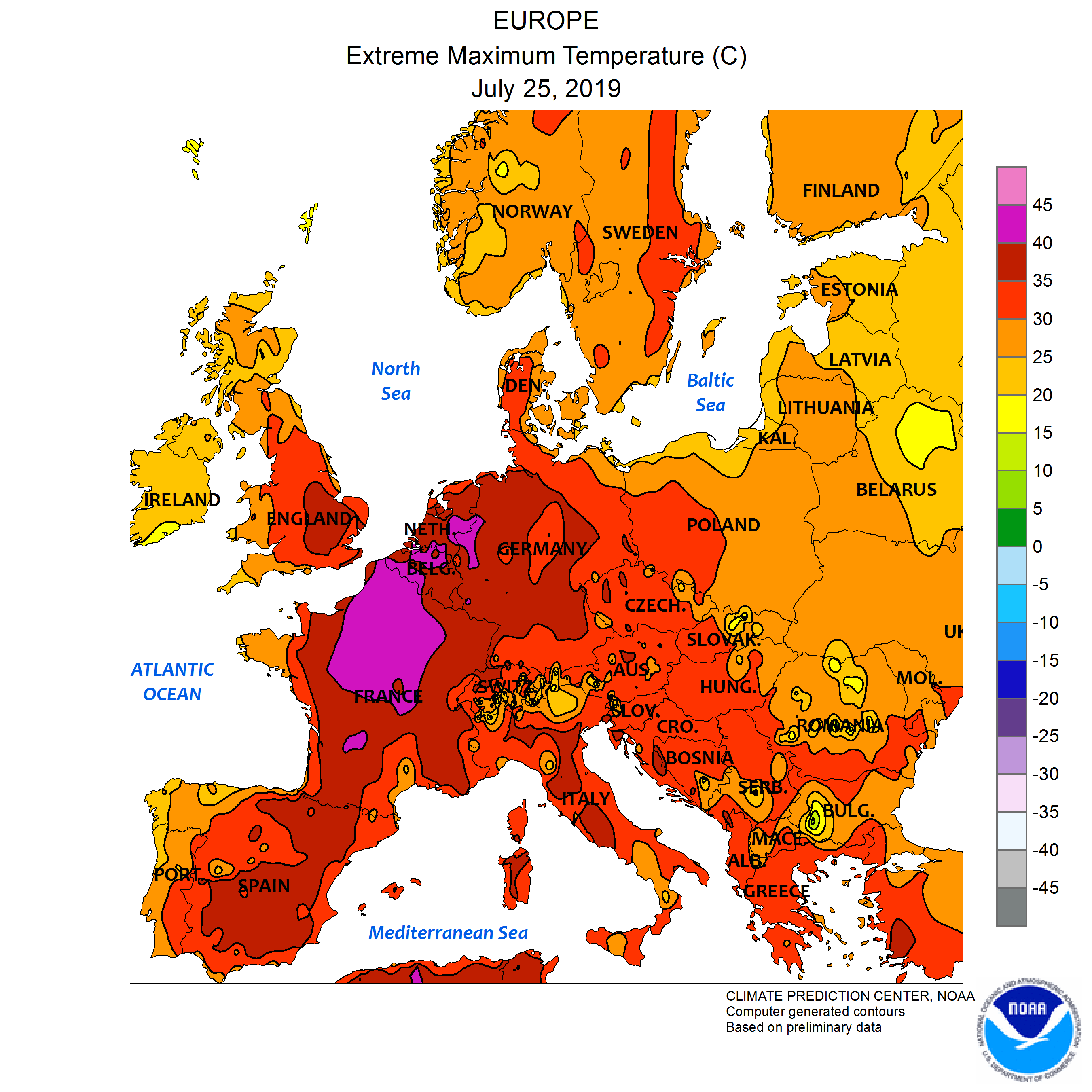
Figure 2. Source: NOAA, July 25, 2019.
In July, the heat returned (Figure 2). A large swath of Northern France, Belgium, and The Netherlands topped out between 104 and 113°F. The high temperature in Belgium was 107.2°F, exceeding the previous record by 5.4°F. Two nuclear reactors in France had to be completely shut down, and 6 more had to curtail generation due to the heat. Thousands of animals died from the heat, as ventilators in barns were overwhelmed or transport trucks overheated. England set an all-time record maximum temperature on July 25, when the temperature hit 101.7 in Cambridge.
.
.
.
.

Figure 3. Source: NASA.
The heat is causing problems outside Europe, as well. Wildfires have broken out across the Arctic. Figure 3 shows the hotspots, as seen from space. This is a polar view, and it is upside-down: the North Pole is in the center near the bottom. Alaska is on the bottom left. The Aleutian Islands are at upper left, with Siberian Russia stretching across the top 1/2 of the image. Fires that can be sensed from space are in red.
As of August 2, 48 large wildfires were actively burning in Alaska, and they have consumed 1,604,724 acres. That is 2,507 square miles, roughly equal to half of Connecticut. Only 1 is contained.
It’s even worse in Siberia. Russian authorities state that 2.7 million hectares (6.67 million acres) are actively burning. It is hard to give meaning to a statistic like that, but it is an area larger than the entire State of Connecticut. This level of fire activity is unprecedented. Originally, Russian authorities did not try to fight the fires, as they were in hard-to-reach areas. Much of Siberia is hard to reach, actually, it is part of the reason the area has not developed more. Now, however, according to the New York Times, Russia has scrambled military transport planes and helicopters to fight the fires, as smoke impacts an ever wider area, including populated cities. These fires are likely to grow even larger before they subside.
Greenland experienced a record melt event in mid-June. As you may know, Greenland is a large island in the Atlantic Ocean. It is in the far north, being the second closest land to the North Pole. It’s very large ice sheet is second in size only to that of the Antarctic, and it has been melting (one of the causes of rising sea levels). Well, the European heat wave in June caused ice to melt over 270,000 square miles of the ice sheet, resulting in an estimated 80 billion tons of ice melting between June 11 and 20, the largest ice-melt event ever recorded this early in the season.
These sorts of events are on the increase. In 2010, wildfires in Russia caused an estimated $15 billion in damage. In 2003, a heat wave in France killed an estimated 15,000. In both cases, authorities were unprepared, because such things had never happened before. What’s going on?
The answer is simple, but unpleasant: climate change.
Here comes the future.
Sources:
European Space Agency [CC BY-SA 2.0 (https://creativecommons.org/licenses/by-sa/2.0)%5D The Heat Is On. Downloaded 8/2/2019 from https://commons.wikimedia.org/wiki/File:The_heat_is_on_(48138322288).jpg.
National Interagency Fire Center. Daily Report, 8/2/2019. Viewed online 8/2/2019 at https://www.nifc.gov/fireInfo/nfn.htm.
Russian Federal Forestry Agency, quoted in NASA. Siberian Smoke Heading Towards U.S. and Canada. July 30, 2019. Viewed online 8/2/2019 at https://www.nasa.gov/image-feature/goddard/2019/siberian-smoke-heading-towards-us-and-canada.
Nechepurenko, Ivan. 2019. “Russia Sends Military Planes to Fight Wildfires in Siberia.” The New York Times, 8/1/2019. Viewed online 8/2/2019 at https://www.nytimes.com/2019/08/01/world/europe/russia-fire-siberia.html.
National Snow & Ice Data Center. “A Record Melt Event in Mid-June.” Greenland Ice Sheet Today. Viewed online 8/4/2019 at https://nsidc.org/greenland-today/2019/07/a-record-melt-event-in-mid-june.
NOAA (Public domain). July 25 2019 Europe max temperatures.png. Downloaded 8/2/2019 from https://upload.wikimedia.org/wikipedia/commons/4/49/July_25_2019_Europe_max_temperatures.png.
Wikipedia contributors, “1995 Chicago heat wave,” Wikipedia, The Free Encyclopedia, https://en.wikipedia.org/w/index.php?title=1995_Chicago_heat_wave&oldid=906011873 (accessed August 2, 2019).
Wikipedia contributors, “2010 Russian wildfires,” Wikipedia, The Free Encyclopedia, https://en.wikipedia.org/w/index.php?title=2010_Russian_wildfires&oldid=892909422 (accessed August 2, 2019).
Wikipedia contributors, “June 2019 European heat wave,” Wikipedia, The Free Encyclopedia, https://en.wikipedia.org/w/index.php?title=June_2019_European_heat_wave&oldid=908888400 (accessed August 2, 2019).
Wikipedia contributors, “July 2019 European heat wave,” Wikipedia, The Free Encyclopedia, https://en.wikipedia.org/w/index.php?title=July_2019_European_heat_wave&oldid=908883144 (accessed August 2, 2019).

.jpg)