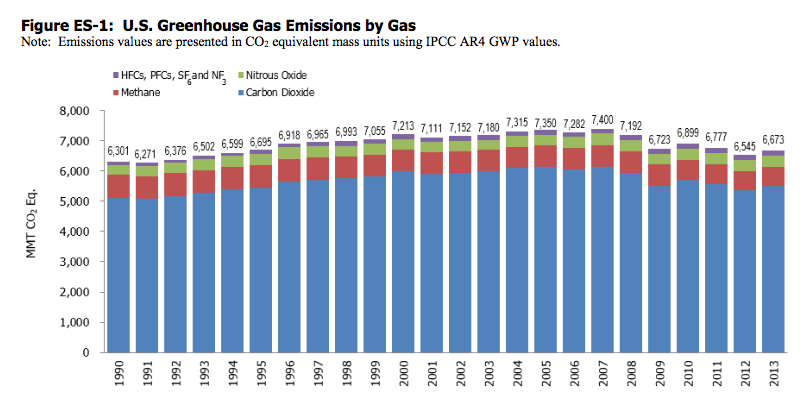
Figure 1: U.S. Greenhouse Gas Emissions 1990-2013; Source: Environmental Protection Agency 2015.
Greenhouse gas emissions were 6,673 million metric tons of carbon dioxide equivalent (MMTCO2e) in 2013, an increase of 128 MMCO2e (2%) from 2012, reports the Environmental Protection Agency in the most recent Inventory of U.S. Greenhouse Gas Emissions and Sinks: 1990-2013. Figure 1 at right shows the trend since 1990. GHG emissions increased through 2007, increasing 14%. Then they decreased until 2012, decreasing 11%. Then they rose in 2013 by 2%. Compared to 1990, emissions were 372 MMTCo2e (6%) higher in 2013.
The blue areas of the columns represents carbon dioxide, showing that it is by far the largest contributor to U.S. GHG emissions. It accounts for 82.5% of all emissions. Municipal, state, national, and worldwide GHG inventories almost always show that carbon dioxide is the largest contributor to GHG emissions.
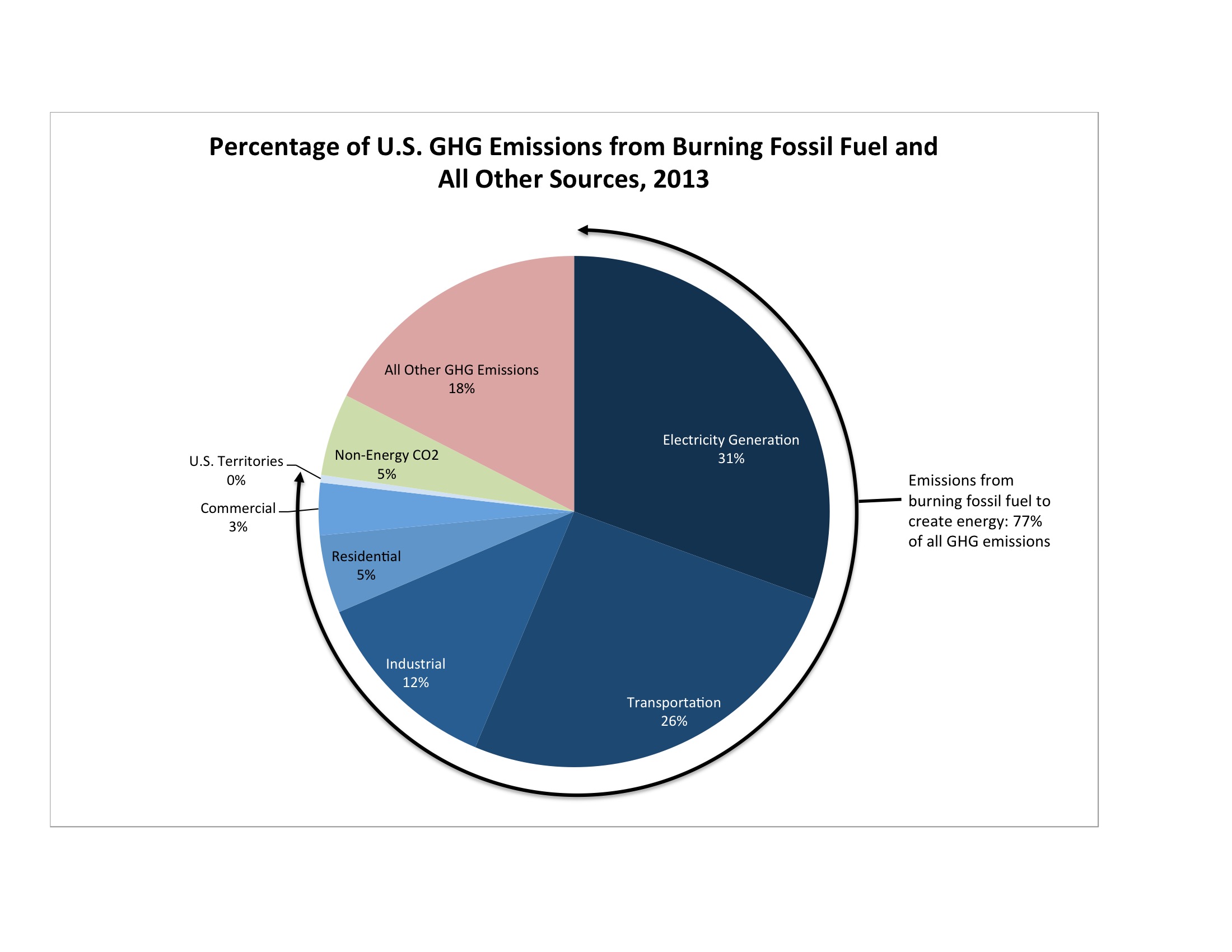
Figure 2: U.S. GHG Emissions from Fossil Fuel and Other Sources, 2013. Data source: Environmental Protection Agency 2015.
Why are humans emitting so much carbon dioxide into the atmosphere? The third chart at right gives the answer: it is emitted when we burn fossil fuel to create energy. Burning fossil fuel to create energy doesn’t just account for the largest portion of carbon dioxide emissions, fully 77% of all GHG emissions can be attributed to it. Figure 2 at right shows the data. On the chart, all of the pie slices that are blue represent emissions from burning fossil fuel to create energy. Only the green and pink slices represent other sources.
.
.
.
.
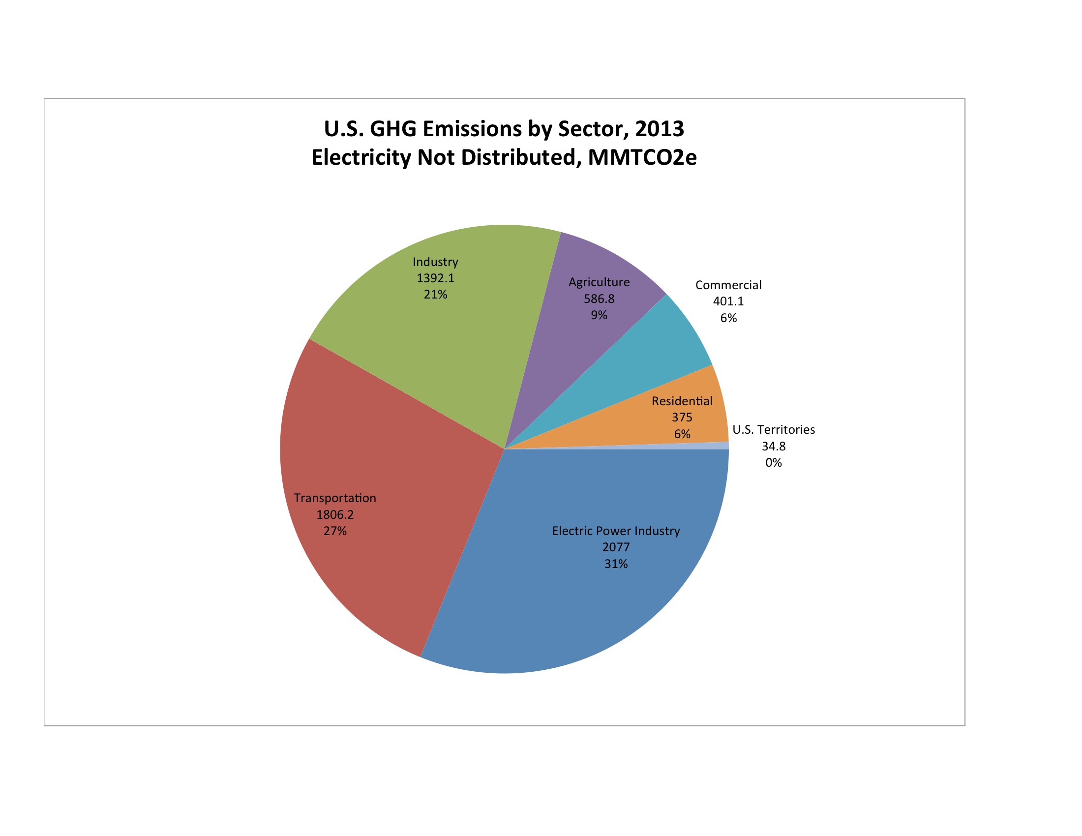
Figure 3: U.S. GHG Emissions by Sector, Electricity Not Distributed, 2013. Data source: Environmental Protection Agency 2015.
So, what are we humans doing that is using so much energy and causing so much GHG to be emitted? GHG inventories try to answer the question by categorizing emissions into economic sectors. When this is done, it almost always shows that the electric power industry is the largest emitter. Figure 3 at right shows that in the United States in 2013, the electric power industry accounted for almost 1/3 of all emissions.
.
.
.
.
.
.
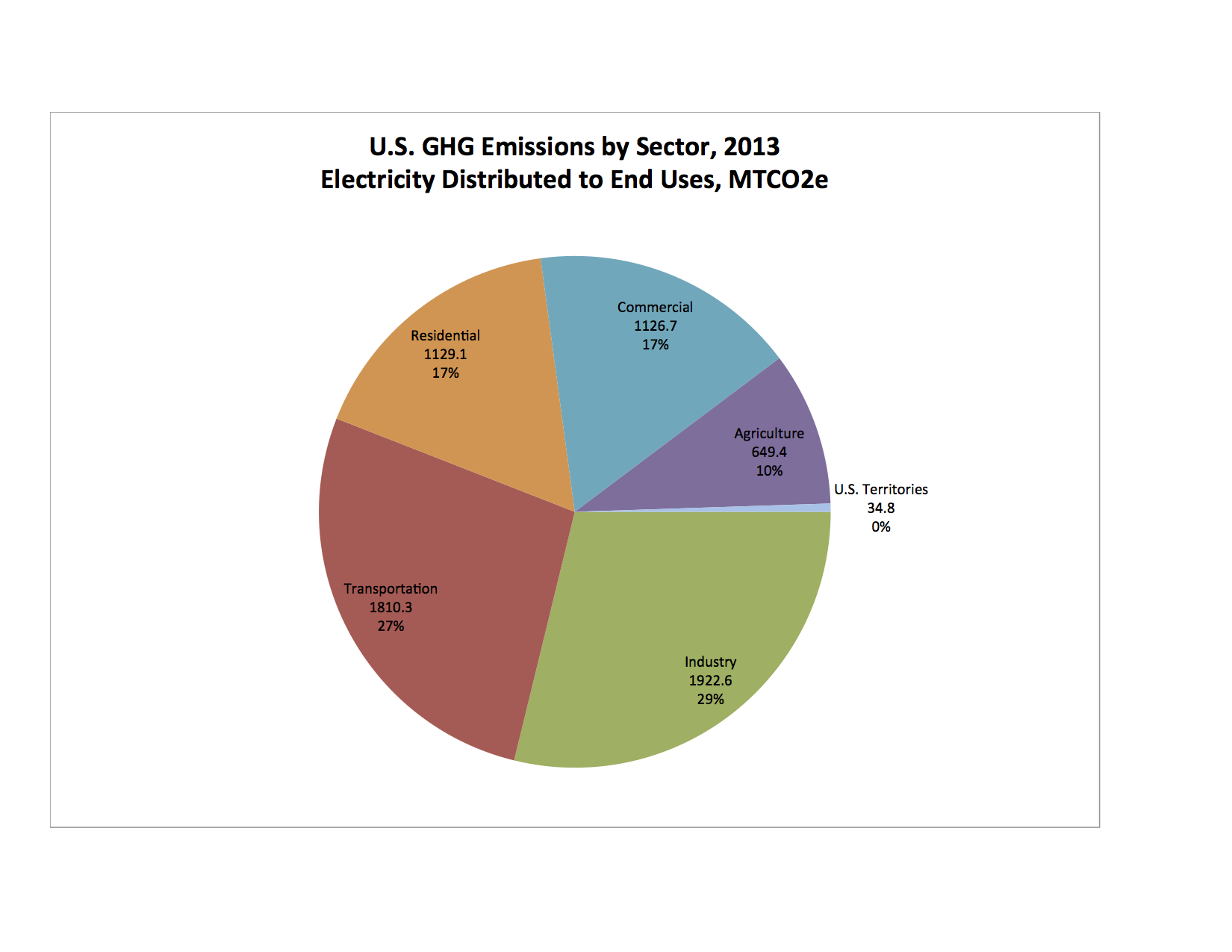
Figure 4: U.S. GHG Emissions by Sector, Electricity Distributed to End Uses, 2013. Data source: Environmental Protection Agency 2013.
Electric utilities, however, do not generate electricity for their own use in their power plants, they generate it to distribute to others. If you distribute electricity generation to the sectors where it is used, then industry was the largest producer of GHG emissions, followed closely by transportation. The data are shown in Figure 4 at right. Thus, in 2013 what Americans did most to use energy and create GHG emissions was, first, to make stuff and, second, to drive and fly around.
As noted above, after several years of decreases, in 2013 GHG emissions increased some 2%. This is not good news. The United States has made progress in establishing policies intended to reduce GHG emissions, however, compared to 1990 our emissions are still 6% higher. The best science, as reviewed by the IPCC, suggests that we need to make steep cuts in GHG emissions, or we will wreck the climate of this planet. This is not a policy blog, so I will not get into discussions of possible policy responses. However, it is clear that, if we need to make significant cuts in the amount of GHG we emit, we are not getting there yet.
Source:
Environmental Protection Agency. 2015. Inventory of U.S. Greenhouse Gas Emissions and Sinks: 1990-2013. Retrieved online 12/29/15 at http://www3.epa.gov/climatechange/Downloads/ghgemissions/US-GHG-Inventory-2015-Main-Text.pdf.

[…] a comparable chart for the USA from the EPA up to 2013. Emissions did not fall at all over the period, and they only peaked in […]
[…] a comparable chart for the USA from the EPA up to 2013. Emissions did not fall at all over the period, and they only peaked in […]
[…] a comparable chart for the USA from the EPA up to 2013. Emissions did not fall at all over the period, and they only peaked in […]